Alina Verkhovskaya | Portfolio
Communication Designer
I’m Alina and I’m Communication Designer
I find the idea that makes a brand unmistakably itself
I’m a communication designer specializing in branding and visual identity. I help small and growing brands develop a distinctive visual character rather than rely on generic solutions
My process begins with researching the brand, its audience, and its competitive landscape. I use these insights to develop an original concept and turn it into a cohesive visual language that works consistently across different communication channels
From research to concept. From concept to system
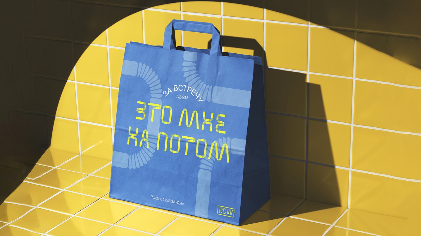
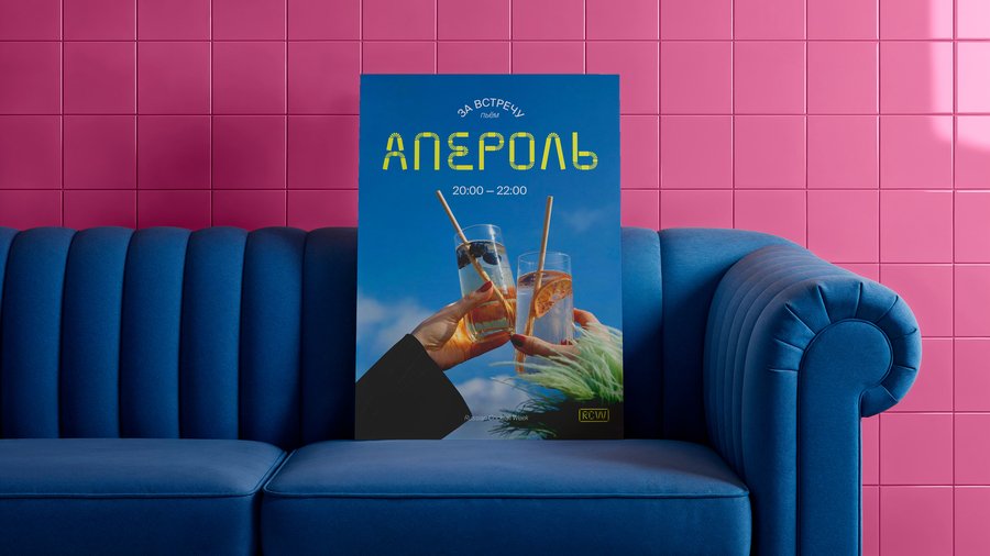
Russian Cocktail Week | Custom Typeface & Festival Visual Identity
When typography becomes part of the cocktail
Russian Cocktail Week is a festival celebrating Russia’s bar culture. The challenge was to create a distinctive typographic identity that captures the festival’s atmosphere and sets it apart from other events
What if you could write a cocktail instead of illustrating one?
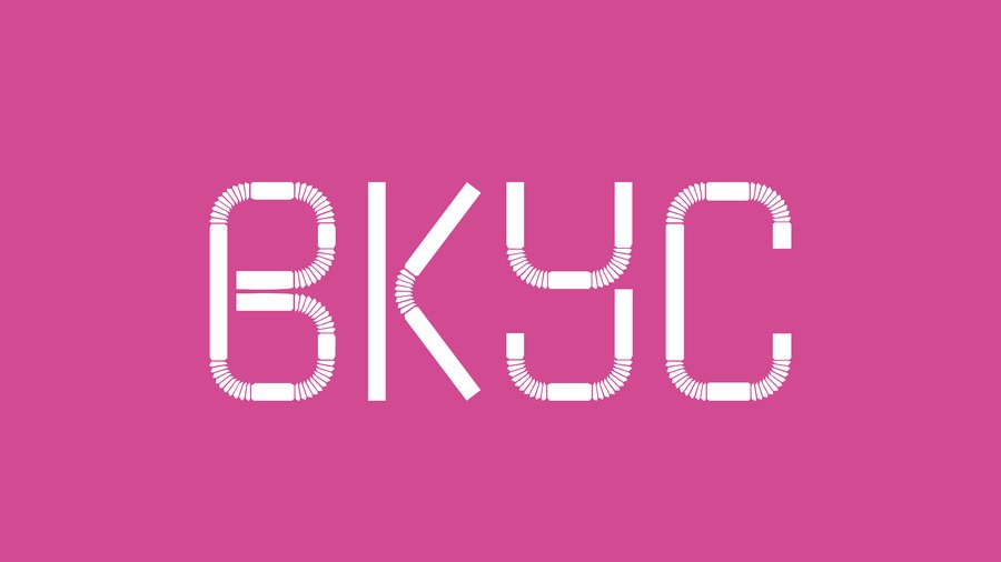
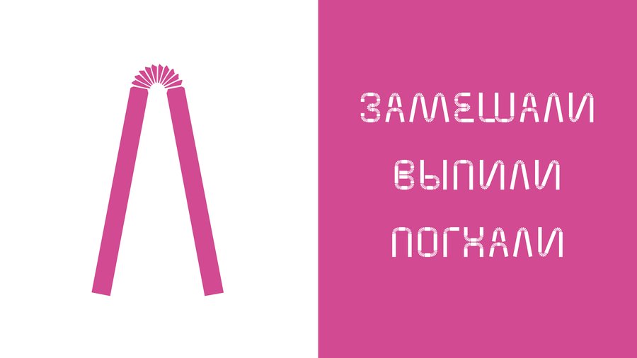
Rather than relying on familiar drink illustrations, I turned to one of the most recognizable objects in bar culture: the cocktail straw. Its straight sections and flexible corrugated joints became the foundation of the letterforms
The result was Solominka, a custom display typeface that makes typography the central expression of the festival’s identity
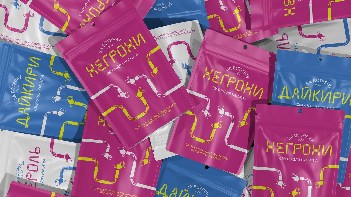
From a single straw to an entire festival
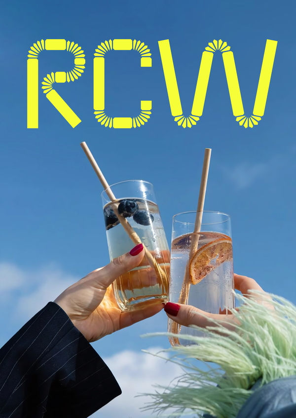
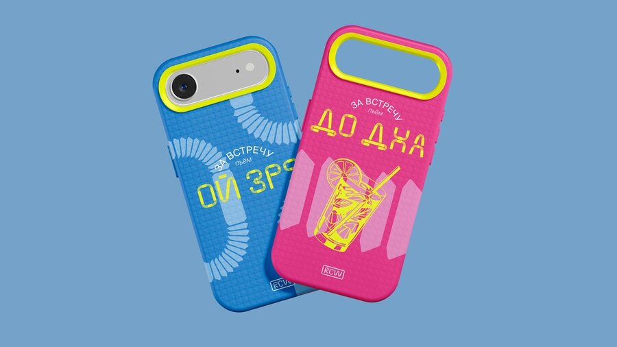
To make the concept work beyond a few individual letters, I developed a consistent typeface structure with two styles, supporting both Cyrillic and Latin scriptsSolominka became the foundation of the festival’s typographic identity. Its distinctive letterforms, vibrant colors, and dynamic compositions create an energetic visual characterThe system extends across posters, packaging, merchandise, and other communication materials, maintaining visual consistency through a shared design principle
The result is a distinctive visual identity concept built around a single idea, developed into a complete design system
Ruslo | Rebranding & Visual Identity
Tradition has a direction
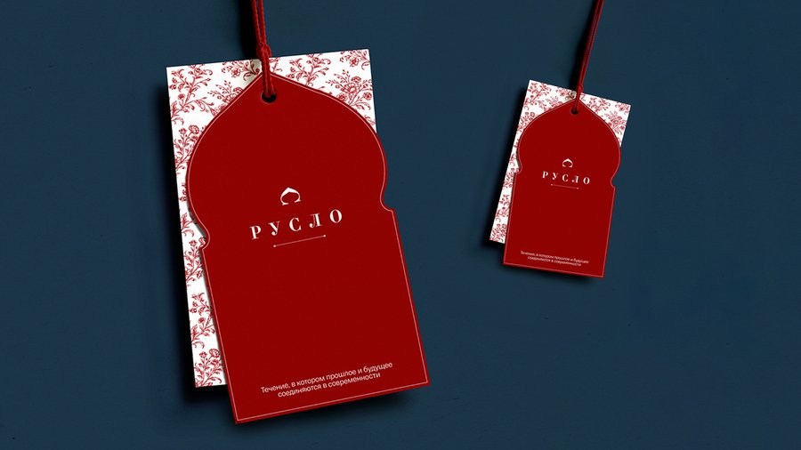
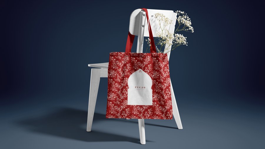
Ruslo is a brand that brings traditional Russian arts and crafts into contemporary life through product design, exhibitions, and visual projects
The challenge was to update and systematize the brand’s visual language, creating a more contemporary and professional identity while preserving its connection to cultural heritage
The concept is based on the idea of a riverbed — a channel through which culture continues to flow. Here, traditions are not static: they evolve, adapt, and take on new forms
This idea is expressed through a logo that combines two visual references:
the kokoshnik, a traditional Russian headdress, and an arrow symbolizing direction and forward movement
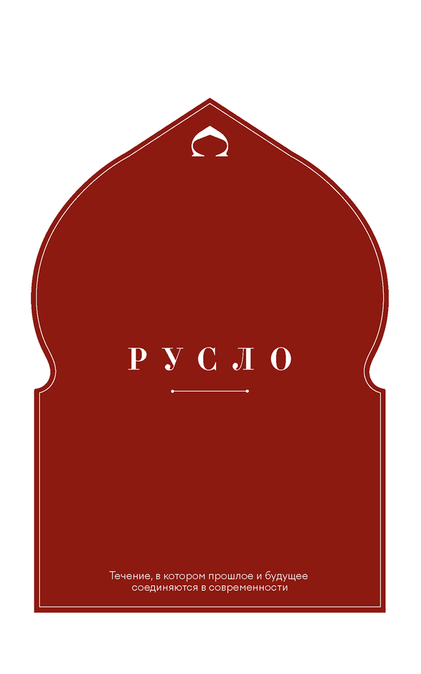
Heritage in a modern interpretationeThe visual system develops the idea of cultural continuity through typography, ornamental motifs, and compositionTraditional references become part of a contemporary graphic language rather than serving as decoration aloneThe identity brings together Ruslo’s different activities, creating a cohesive brand image that draws from the past while looking toward the futureThe result is a contemporary identity concept that transforms cultural heritage into a foundation for new visual expressions
Kresty | Art Cluster Branding & Visual Identity
A place with a past — a space with a future
The challenge was to create a contemporary, welcoming, and engaging identity without ignoring the building’s complex history
How do you change the meaning without changing the name?
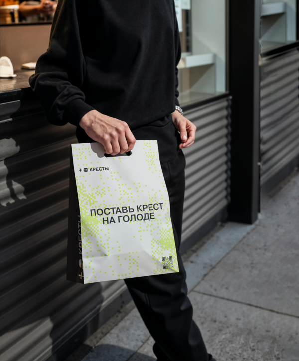
The name Kresty, meaning «crosses,» is inseparable from the building’s past. Rather than avoiding this association, I chose to reinterpret it
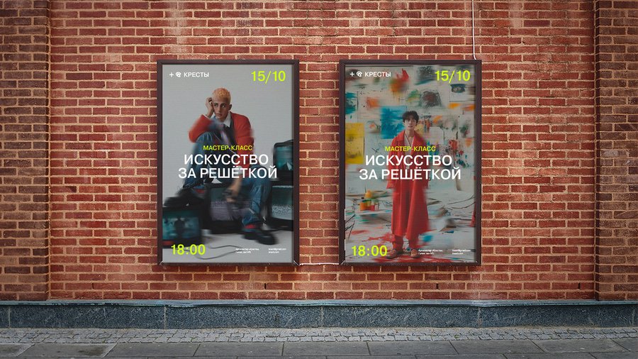
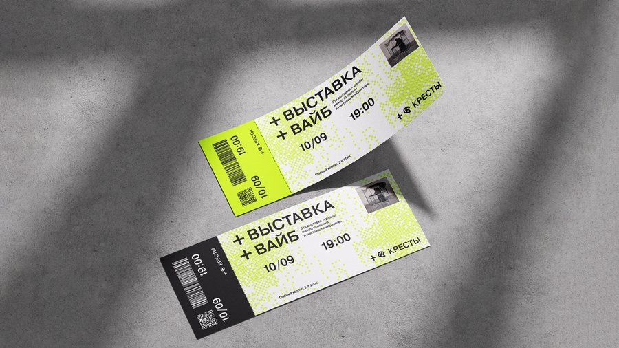
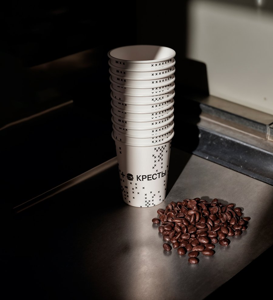
The cross becomes a plus sign — a symbol of addition, connection, and new possibilities. Two plus signs form the foundation of the identity, reflecting the transformation of the space itself
«Add New Meanings» is a concept that turns a symbol of the past into a tool for shaping the future
One symbol. Endless new possibilities.A simple graphic idea becomes the foundation of a flexible visual systemThe plus signs evolve into patterns, typographic compositions, wayfinding, and communication materials. A shared design principle connects the art cluster’s different functions without restricting them to a single visual formatBold graphics and a vibrant color accent create a contemporary identity for a space open to new cultural initiativesThe result is a scalable brand identity system that reinterprets the historical context and gives the place a new visual character
Battle of the Crews | Branding & Visual Identity for a Reality TV Show
Battle of the Crews is a reality competition in which construction teams compete to build and finish country houses, completing every stage from foundations to interiors
My task was to create a bold, clear, and memorable brand identity system that captures the show’s competitive spirit and adapts to television formats
The logo is built around two saws facing each other. Their jagged edges symbolize the rivalry between teams, while heavy typography and contrasting colors reinforce the sense of energy and tension
Visual conflict becomes the central element of the brand