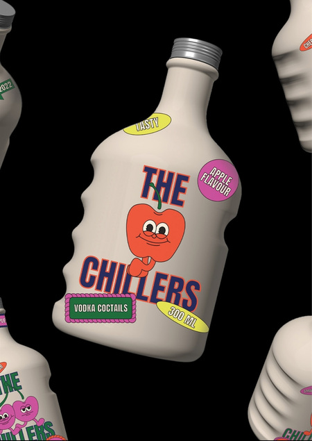
Communication theory: «The Chillers»
(1) Communication theory in the field of design
In branding, visual communication functions not as a direct transmission of information but as a system of signals that shapes the audience’s attitude toward a product. Decisions about trust and interest are often made at the level of atmosphere, style, and cultural codes, prior to rational analysis. In this sense, design does not merely accompany a product but establishes the framework through which it is perceived.
For this reason, communication theory in this project is used as an analytical tool that helps explain why visual decisions are interpreted in a particular way. It makes it possible to examine branding not only in terms of form, but also in terms of meanings, expectations, and patterns of behaviour that a brand offers to its audience.
The theoretical foundation of the project is based on Robert Craig’s model of communication traditions. The rhetorical tradition allows design to be analysed as a means of persuasion and trust formation. The sociocultural tradition frames branding as a mechanism for transmitting values and lifestyles. The critical tradition provides a perspective for examining how a brand relates to dominant market codes and where it deliberately distances itself from them.
Brand for further analysis
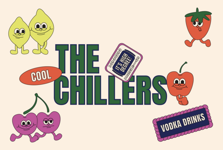
''THE CHILLERS'' — alcohol beverage brand based on organic vodka
(2) Brand presentation for general audience
Cocktails based on organic vodka by The Chillers represent a new format of ''pure'' and conscious pleasure.
They offer an alternative to the conventional idea of fun, where enjoyment is often built on ignoring consequences for oneself and for the environment.
The Chillers proposes a different approach, showing that pleasure can coexist with responsibility, attentiveness, and long-term thinking.
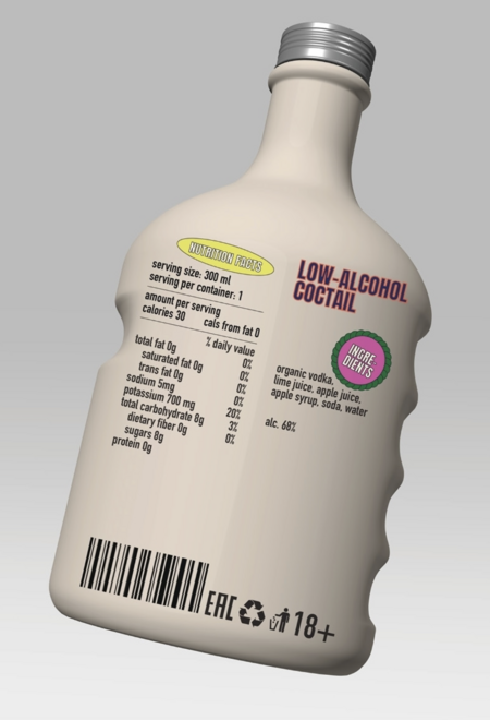
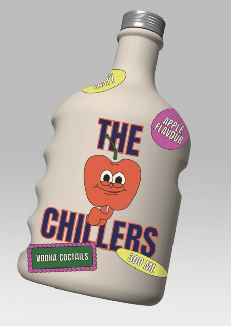
At the core of the product is a commitment to naturalness and transparency in production. Only organic ingredients are used, sourced without exhausting the soil, use of pesticides, or chemical additives. The drinks contain no artificial enzymes, defoamers, colorants, or flavorings.
A pure formula is not merely a product attribute, but a way of saying to the world:
''I choose thoughtful pleasure''
After all, style is not only about clothing, but also about the products people make part of their everyday lives. This is why the product’s aesthetic is designed to align with the audience’s lifestyle, functioning as a marker of responsible consumption and a means of recognizing like-minded individuals.
The brand seeks to shape a new social norm for people who approach pleasure consciously and perceive responsibility as something aesthetically pleasing and natural. The product encourages living lightly and enjoying the present moment without becoming careless, while keeping the future in mind.
The Chillers promotes a mindful approach to taste, to one’s own choices, and to what remains after the moment has passed.
(3) Brand presentation for professional audience
From a professional perspective, The Chillers functions as a coherent visual communication system in which individual identity elements do not operate in isolation but are interconnected. The brand is designed as a flexible structure capable of adapting to different media and contexts while maintaining recognisability and semantic consistency.
Graphic Principles and System
The graphic system of the brand is built around fruit illustrations presented as characters, as well as modular sticker-like elements. These components function as recurring visual accents that enhance memorability and create a sense of lively, dynamic communication.
The underlying metaphor draws on the philosophy and subculture of the hippie movement of the 1960s–1970s, where characters and symbolic imagery were widely used as visual carriers of shared values. These references inform the overall visual language of the brand.
At the level of design methodology, this leads to a rejection of rigid, predefined compositions. Instead, the system creates a visually comfortable field that allows for appropriation and variable interpretation. Sticker graphics, characters, and modular elements do not impose a fixed reading but function as open signs that the audience can integrate into their own cultural context.
From a professional standpoint, the characters act as mediators between the brand and its audience. They reduce communicative distance, introduce an element of play, and enable variation within the visual language without compromising the coherence of the system. The graphic elements are easily scalable and adaptable to different formats, which increases the versatility of the brand identity.
Logo as a System, Not a Static Mark
The The Chillers logo is designed not as a static sign but as a variable system. It allows for changes in colour combinations and application across different visual environments while remaining recognisable. This variability enables the logo to adapt to the context of the medium, which is particularly important within contemporary digital communication.
From a communication perspective, the logo functions as a stable visual marker whose recognisability is supported by recurring formal features rather than by rigid fixation in a single visual state.
Typography and Graphic Language
The typographic solution — a contemporary grotesque with a retro inflection — balances modernity with visual warmth. In terms of communicative effectiveness, this typographic choice lowers perceptual barriers and supports a friendly, unobtrusive tone of voice, which is especially relevant when addressing a broad audience within visually saturated environments.
Colour as a Communicative Code
The colour palette of The Chillers is based on saturated tones with a subtle vintage shift, shaping the brand’s visual identity and defining its overall tone. These colours function as stable communicative codes that allow the brand to remain easily identifiable across different formats, from packaging to digital media. The palette reinforces the idea of «pure pleasure» while avoiding aggressive contrasts and visual overload.
Packaging as Medium and Interaction Scenario
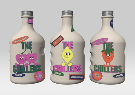
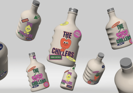
The packaging of The Chillers is treated as a full-fledged communication medium rather than merely a container for the product. The non-standard bottle shape with a comfortable grip emphasises the brand’s focus on user experience and physical interaction.
For a professional audience, it is significant that the packaging integrates visual expressiveness with functionality. Physical interaction with the object becomes part of the brand experience, strengthening the connection between visual identity and everyday use.
Positioning in the Market Context
Within the market context, The Chillers positions itself as an alternative to dominant models of alcohol branding, which often rely on visual aggression and masculinised codes. The brand occupies a niche where ecological values are combined with bright and positive visual communication, proposing a different model oriented toward lightness, openness, and visual pleasure.
(4) Brand presentation in the context of the communication theory
Brand Through the Lens of the Elaboration Likelihood Model
In the Elaboration Likelihood Model, the course suggests distinguishing between two routes of message processing: the analytical (central) route and the emotional-visual (peripheral) route. The Chillers strategically engages both routes simultaneously.
On the central route, the brand provides rational, verifiable arguments such as organic ingredients, absence of artificial additives, transparent production processes, and environmental responsibility. These elements target consumers motivated to think critically about sustainability, and ethical consumption.
On the peripheral route, the brand relies on visual identity, playful aesthetics, and associations with a particular lifestyle. These cues evoke positive emotional responses and instant liking without requiring deep cognitive processing. The product «feels right» even before rational evaluation.
By combining both routes, The Chillers increases the durability of its persuasive impact. Consumers can justify their choice both emotionally and rationally, which contributes to forming stable attitudes and long-term brand loyalty.
The Chillers Brand Through Optimal Distinctiveness Theory
Optimal Distinctiveness Theory views identity formation as a process of continuously balancing two opposing needs: the desire to belong to a social group and the desire to maintain individuality. In The Chillers’ communication strategy, this balance becomes a key principle of brand building.
On one hand, the brand constructs a sense of collective identity through shared values—mindful enjoyment, environmental responsibility, and a contemporary lifestyle. These elements create a cultural field where consumers can recognize those who identify with the group and relate to a community in which responsibility is not opposed to pleasure but included within it.
On the other hand, The Chillers emphasizes individual distinctiveness through expressive, unconventional visual language, allowing each consumer to feel their uniqueness through the distinctive design of each bottle.
The Chillers and Face-Saving Theory
Face-saving theory considers communication as a means of maintaining a positive social image and avoiding shame or social discomfort. In branding, this means that a product should help consumers appear appropriate and socially acceptable.
The presentation of The Chillers minimizes the risks of «losing face» associated with alcohol consumption by promoting the discourse of «responsible enjoyment» which combines pleasure with responsibility. Its environmental friendliness, organic composition, and production transparency provide consumers with clear arguments to justify their choice in any social situation. The brand’s visual and verbal communication functions as a preventive face-saving mechanism, offering a safe language of self-presentation in advance. Its aesthetics avoid provocation or moralizing and instead show the process of leisure in a fun and vibrant way while being mindful of the environment, reducing the risk of face-threatening acts.
Thus, The Chillers acts not just as a product but as a communicative resource supporting the consumer’s positive social image.
Mordvinova M., Solovyova O. Communication Theory: Bridging Academia and Practice online-course. HSE. URL: https://edu.hse.ru/course/view.php?id=133853 (Accessed: 01.12.2025)
Craig R. T. Communication Theory as a Field // Communication Theory. — 1999. — Vol. 9, No. 2. — P. 119–161— DOI: 10.1111/j.1468-2885.1999.tb00166.x (Accessed: 01.12.2025)
Calhoun C. Communication as Social Science (and More) // International Journal of Communication. — 2011. — Vol. 5. — P. 1479–1496. — ISSN 1932–8036. — URL: http://ijoc.org (Accessed: 05.12.2025).
Allison T. H., Davis B. C., Webb J. W., Short J. C. Persuasion in crowdfunding: An elaboration likelihood model of crowdfunding performance // Journal of Business Venturing. — 2017. — Vol. 32, No. 6. — P. 707–725. — DOI: 10.1016/j.jbusvent.2017.08.001. (Accessed: 02.12.2025)
Айдентика для бренда алкогольных напитков «The Chillers» // Студенческое портфолио URL: https://portfolio.hse.ru/Project/151115 (Accessed: 30.11.2025)
Упаковка для бренда слабоалкогольных коктейлей на основе органической водки «The Chillers» // Студенческое портфолио URL: https://portfolio.hse.ru/Project/165263 (Accessed: 07.12.2025)
