

Contents:
- Communication theory in the field of design. Narrative and visual strategies
- Brand presentation for a broad audience
- Presentation for a professional audience (designers)
- How we used communication theory to create the brand strategy
Communication theory in the field of design. Narrative and visual strategy
As a team, we used the course concepts to rethink communication specifically in a design context. In design, communication is not just the delivery of information — it is the construction of meaning through visual form, structure, and interaction. Any interface, poster, or identity system functions as a message: it selects what to show, what to hide, what to emphasize, and what emotional tone to set. The viewer then interprets this message through their own cultural background, personal experience, and expectations.
According to Craig’s 7 traditions in communication theory, from a semiotic perspective, design works through signs: color, typography, imagery, layout, and interface patterns carry meaning even without explicit explanation. From a sociocultural perspective, design is embedded in everyday practices — scrolling, sharing, browsing, learning, consuming content — and it either reinforces or reshapes what feels «normal» in those practices. From a rhetorical perspective, design also persuades: it builds trust (ethos), provides arguments or evidence (logos), and creates emotional engagement (pathos), especially in digital environments where speed, interactivity, and visuals dominate.
At the same time, communication is always relational. Brands and products do not only «talk» — they build a relationship with the audience. Here Politeness Theory is useful as a practical lens: design and tone of voice can either invite the user in or create distance, either support curiosity or trigger insecurity and gatekeeping.
Finally, people process messages differently depending on attention and motivation. The Elaboration Likelihood Model explains why some users want deep, rational content (using the central route), while others enter through quick cues, aesthetics, and cultural references (using peripheral route). For a communication strategy, this means we need systems that can work for both modes without losing coherence.
Presentation of the PARASHUT brand for a broad audience
Who we are
We are an online archive and storytelling platform about unusual inventions and the people behind them. We collect verified stories, sketches, and «traces» of ideas that were misunderstood, rejected, or ahead of their time — and we present them in an interactive, playful form.
Our goal
To make science and invention feel human, emotional, and culturally diverse — without losing accuracy.
Who the brand is for
- Curious users (roughly 18–35) who like history, science, culture, museums, internet-archives, and «weird knowledge».
- Students and young professionals who enjoy learning in a non-boring way.
- People who feel «different» and want community narratives where being strange is normal.
We let our audience be a part of the process of creating the meaning: users don’t just receive content — they interpret it through their own experience of curiosity, rejection, and identity.
Our message
Main message: «Weird inventions — true stories». Supporting message: «Being curious isn’t weird».
Instead of looking like a dry catalogue, our website feels like a living archive. It’s as if a scientist left behind their notes, sketches, and searches — and you’re following these traces. So exploring the site becomes a small adventure: you don’t just read articles, you discover connections and piece the story together.
Our mission
We make science history feel human and exciting
We collect real stories about unusual inventions and the people behind them, explain them in a clear way, and create a space where curiosity is welcome — even if your interests are «weird».Tone and relationship
We design the brand as friendly and non-gatekeeping. The tone supports our «positive face»: our brand treats curiosity as intelligence, and «weirdness» as normal. This helps users feel safe to explore, ask questions, and join discussions. We are building our relationship with the audience based on trust and respect and make it our goal to always fact-check all the information on our platforms.Brand values
- Reliability: sources, verification, and careful framing.
- Empathy: approachable voice and accessible presentation.
- Curiosity without shame: shared identity around «being strange».
- Global perspective: inventors beyond the Western canon, multilingual and cross-cultural framing.
Presentation for a professional audience (designers)
Positioning
Category:
Edutainment / digital archive / cultural-media product.Positioning statement:
We are a verified, story-driven web archive that makes invention history accessible through a «haunted archive» interface — combining popular-science clarity with internet-native aesthetics and community participation.Color palette and visual identity
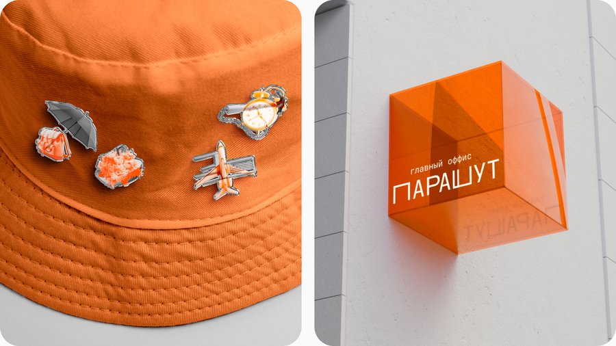
The color palette for our brand is predominantly grey, white, and black, with orange as an accent color. This color scheme was chosen to convey a sense of the strange and unusual, reflecting the nature of the inventions featured in our archive. The use of grey and white creates a clean, minimalist aesthetic, while the bold orange adds a playful and eye-catching element.Graphics and illustrations
The visual assets for our project, such as illustrations and graphics, are designed to embody the spirit of the «strange inventions» we showcase. By combining incongruous elements, like a chair and an airplane to create a «chair-plane», we aim to capture the whimsical and unconventional nature of the inventions featured in the Parachute Museum.Logo
Our logo is written in the Cyrillic alphabet, with a playful misspelling («у» instead of «ю»), reflecting the quirky and off-beat tone of the project. The slightly stretched letterforms also serve as a metaphor for the people and ideas that don’t quite fit into the conventional mold.Communication approach
1. Tone of voice and UX microcopy
Goal: to create a friendly, non-judgmental brand face, according to politeness theory* Avoiding «expert arrogance» and using more invitations («Let’s check», «Here’s what we know») than verdicts. * Error states and onboarding are supportive («It’s okay to start anywhere»). * Respect for both people in stories and users.
2. World-building in UI
Goal: to make the site feel like a story space, not a catalogue, achieve this by using narrative paradigm* «Scientist traces» appear as interface artifacts: notes, sketches, marginalia, saved searches. * Navigation is built as exploration: users can follow themes, time, emotions, «failed attempts», or «obsessions».
3. Two-layer content system
Goal: to fit different attention spans without lowering quality using elaboration likelihood model* Central route: fact-checking, clear structure, sources, timelines, explainers in simple language. * Peripheral route: memes/jokes (careful, not cynical), pop-culture references, Y2K & modern editing contrast, visuals to create a feeling of nostalgia.
4. Community identity
Goal: to create a shared fantasy/theme that unites users as a part of symbolic convergence * Community narrative: «We collect evidence that ‘weird’ ideas are part of progress.» * Participation mechanics: users suggest stories, help with tagging, translation, sourcing, and discussion — building a «science enthusiasts» group identity.5. Channel strategy
Goal: to adapt persuasion to digital conditions (speed, interactivity, visuals). * The platform is promoted through short-form content (Reels/TikTok) to quickly catch users’ attention * Interaction is part of the brand communication: comments, Q&A, community prompts («Which invention feels like today?»). * Content formats are mixed deliberately: video, text, image, UI fragments (screenshots of «notes», sketches).6. Multilingual and inclusive framing
Goal: to show invention as a universal experience, not a local myth. * Stories from different countries; translation into multiple languages. * Comparative framing: similar patterns of rejection/recognition across cultures. * Community connection across gender, age, nationality — «curiosity is universal».7. Relationship with audience and feedback
Goal: to build trust as a long-term relationship, not a one-way campaign. * Serious fact-checking * Feedback is studied and used to improve topic sensitivity and accuracy * Respect for historical figures8. UX as communication ethics
Goal: to pay extra attention to the way users interact with the platform * Accessibility and usability: clear IA (UX/ UI), readable typography, predictable navigation. * MVP testing: we test how users actually explore stories and where they get confused. * Comfortable participation: low-barrier contribution, clear moderation, visible rules.How we used communication theory to create the brand strategy
From theory to a coherent system
1. Politeness Theory → brand voice
We designed the brand face as friendly and approachable. This supports learning, community safety, and long-term trust.2. Narrative Paradigm → concept decision
We chose a story-world («restless scientist archive») because people remember stories better than isolated facts, and because it turns education into exploration.3. Elaboration Likelihood Model → content architecture
We designed two routes on purpose: fast emotional entry (peripheral) & verified depth (central). This prevents the project from becoming either «too academic» or «too meme-only».4. Symbolic Convergence → community mechanics
We built identity: «being strange is normal». This connects users not only to content, but to each other — and supports organic growth.5. Digital rhetoric → channel behaviour
We treat social media and the website as one rhetoric system: quick formats attract attention, the site provides depth, and interaction builds loyalty.6. Global village → universal community
We connect people from different countries and present stories from a variety of cultures, creating a community where people feel connected regardless of their age, gender, nationality and other characteristics.7. Two-way symmetrical PR → maintaining close relationship with the audience
Feedback loops and transparent sourcing protect credibility of our platform and help us improve while maintaining close relationship with our audience.Communication Theory: Bridging Academia and Practice [Электронный ресурс]: lectures 1.1–1.6, 4.4–4.5; module on critical theory, Marxism and the Frankfurt School. — 2025. — Режим доступа: внутренний электронный курс (LMS). — Дата обращения: 14.12.2025.
Griffin, E. A. A First Look at Communication Theory / E. A. Griffin. — New York: McGraw-Hill, 2012.
Petty, R. E. Communication and Persuasion: Central and Peripheral Routes to Attitude Change / R. E. Petty, J. T. Cacioppo. — New York: Springer, 1986.
Grunig, J. E. Managing Public Relations / J. E. Grunig, T. Hunt. — New York: Holt, Rinehart and Winston, 1984.
Craig, R. T. Communication Theory as a Field / R. T. Craig // Communication Theory. — 1999. — Vol. 9, № 2. — P. 119–161.
Educational project «Parachute — Media About Strange Inventions» [Electronic resource]. — Available at: https://hsedesign.ru/project/ebda2d2126a146a686a3cda7fc23b386 (accessed 14.12.2025).


