Hypothesis
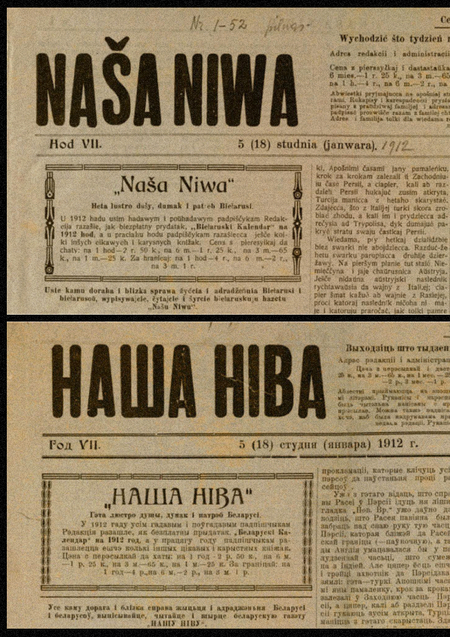
Belarusian script is a rare case in European typographic history: for several centuries, one language coexisted in two entirely different graphic systems—Latin and Cyrillic—both used concurrently within the same state for that single language.
Most European alphabets evolved slowly—driven by pressures from technology, fashion, and new typographic tools. The Belarusian script changed differently: not gradually, but at moments of choosing between two traditions—the Western European typography relied upon by Latin script, and the East Slavic standard carried by Cyrillic. Two alphabets for one language are not simply two sets of characters; they represent two different visions of how the Belarusian letter should appear.
Such stories exist in other languages as well. Serbian currently exists in two systems simultaneously—Cyrillic and Latin—and both are official. Azerbaijani has gone through four alphabets in the last hundred years: Arabic, Latin, Cyrillic, and then Latin again. In 1928, Turkish completely changed its script over several years—from Arabic to Latin, by the decision of Atatürk. There is also a very radical example: Hindi and Urdu are one spoken language, divided by religion and written in two alphabets that share no visual resemblance.
The Belarusian case among all these examples stands apart for two reasons. First: Latin and Cyrillic did not exist sequentially, but simultaneously, within one state, for one language, as two equal variants. This is not a regional difference or a historical replacement of one by the other—it is a real parallel existence. Second: each system had its own visual tradition. Latin leaned toward Western European printing and Polish typography, while Cyrillic aligned with East Slavic and later Soviet norms. Two logics, two ways of conceptualizing how a letter should look—and both operating concurrently for one language.
This research is based on the premise that the visual form of the Belarusian letter changed not gradually, but abruptly—at moments when one graphic system replaced another due to external decisions, rather than internal typological logic. Where most writing systems evolved organically—through typeface experimentation, new printing technologies, or shifts in aesthetic taste—the Belarusian letter changed its form in response to which system was the reigning standard at any given time. Each such moment was reflected throughout the entire written culture of the language—in how texts appeared, what conventions were considered correct, and which traditions became the model. The Belarusian typeface developed not through steady evolution, but through a series of breaks—and it is these breaks that this research seeks to observe and describe.
Table of Contents
It is worth noting that Cyrillic and Latin were not the only writing systems for the Belarusian language. From the 14th to 15th centuries, Tatars who migrated to the Grand Duchy of Lithuania used Arabic script—this is how kitaby originated. Since this tradition did not gain widespread adoption, and its full analysis requires a separate expert review and context, I will not address it within the scope of this study. Nevertheless, for the sake of a complete picture, this fact should be recorded.
{1} Concept {2} Skaryna and the Dawn of Print — 16th Century {3} Latin as the Standard — 18th–19th Century {4} Two Alphabets Simultaneously — 1920s {5} The Belarusian Script Today {6} Conclusion {7} Sources
Skaryna and the dawn of printing—16th century
2.1 Early Printed Editions
In 1517, Francis Skaryna published the «Psalter» in Prague—the first printed book in Old Belarusian and the first printed edition among all East Slavic peoples. Skaryna did not print for the church—his books were small-format, including introductions and commentaries written in accessible language. The goal was to make the text available to the ordinary reader. In two years, he published 23 books of the Bible, then founded a printing house in Vilnius. This was the moment when the Belarusian letter first received a stable printed form.
Skaryna intentionally chose Cyrillic. His audience was the Orthodox resident of the Grand Duchy of Lithuania, for whom Cyrillic was not merely an alphabet—it was the language of the church, prayer, and book culture.
Skaryna states his intent directly in the preface to the Psalter: «so that my brethren of Rus’, the common people, might better understand it while venerating it”—so that ordinary people, upon reading, could comprehend more fully. Skaryna made a choice for his reader—and this choice defined the graphic form of the first Belarusian printed book.
Francis Scorin «Psalter, ” 1517
2.2 Typographic Characteristics of the Font
Skaryna’s typeface is a Cyrillic semi-uncial, but with a noticeably lighter character: the strokes are less contrasted, the proportions of the capitals are broad, and the letters «o,» «c,» and «e» approximate Latin forms.
This is a direct consequence of Skaryna’s education—he studied in Kraków and Padua, handled Western European books, and saw the typefaces of Jenson and Aldus Manutius. Venetian Antiqua left an indelible mark on how he conceptualized letterform.
Francisco Scoricia «Psalter, ” 1517
Francis Скорина «Psalter, ” 1517
Francisco Scoricia, «Psalter, ” 1517
Its main innovations are not in the alphabet itself, but in the page’s organization: for the first time, spaces between words appear in Cyrillic printing, along with a title page, foliation, and paragraph indents. The book stops being a continuous stream of text.
For comparison—Octoich of Swypolt Fiol (Krakow, 1491), the first Cyrillic printed book. There, the typeface is heavy, the page is dense, and there are no spaces—Cyrillic functions as a direct continuation of manuscript script. Skaryna maintains the same tradition, but with his own hand: a Western influence that changes both the shape of the letter and the logic of the entire page.
Left: Francis Scoricina, «Psalter, ” 1517. Right: Swapolth Fiol, „Octoich, ” 1491.
Left: Francis Scorin, «Psalter,» 1517. Right: Swartcoll Filol, «Octoich,» 1491.
The Lacedaemonian as the norm — 18th–19th century
3.1 The Influence of Polish Typography
In the 17th–19th centuries, a Latin script modeled after Polish writing was widely used. In the early 19th century, the first literary works in the Belarusian language—by Yan Chachot, Pavlyuk Bagrim, and Vincent Dunin-Martsinkevich—were composed using a Latin orthography based on the Polish model.
Following the Treaty of Lublin in 1569, the influence of Polish culture intensified—leading to the Polonization of the nobility, schools, and printing. During the latter half of the 17th and 18th centuries, the Belarusian language was gradually displaced.
Left: Adam Mickiewicz, «Pan Tadeusz, ” 1852. Right: Vincent Dunin-Marcinkiewicz, „Gapon, ” 1855.
3.2 What Belarusian Latin Script Looked Like
The letterform was not determined by Belarusian tradition—it simply didn’t exist—but by the font availability at a specific print shop. Legal publications, such as Dunin-Martsinkevich’s «Garon» (1855) and his translation «Pan Tadeusz» (1859), were printed in professional Polish printing houses and looked like a standard Western European book—classical serif typography, neat typesetting, and a clear heading hierarchy. Visually, they are indistinguishable from Polish publications of that era.
Left: Kastus Kalinovskis, «A Letter from Yasik-Gaspadar from under Vilnius,» 1862. Right: Kastus Kalinovskis, «The Peasant Truth,» 1862.