[CONTEXT] — a service that verifies bold claims for accuracy, showing whether they are supported by facts and research.
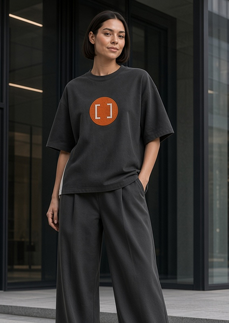
A t-shirt was developed for its merchandise that conveys the brand’s idea through contrast and the very structure of the garment.
Contrast that changes perception
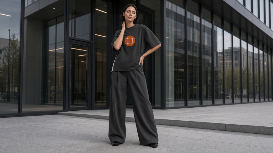
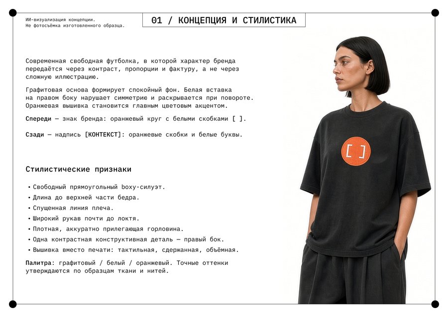
In the t-shirt, I continued this idea through construction: a white insert runs along the right side of the graphite base and unfolds upon turning.The color palette continues the brand identity: graphite, white, and orange. On the front, there is an embroidered orange circle with white brackets; on the back, the word [CONTEXT] is in white within orange brackets. The embroidery adds texture to the design, and the side insert translates the idea of contrast from the graphics into the structure of the t-shirt itself.
Submission Materials
The prepared technical package includes a PDF description, two vector technical sheets with PNG previews, a preliminary specification, and the original logo with a mock-up application variation.