Navigation
1. Introduction. How the future looked in 2000
2. Background. The future before 2000 (1950s–1990s)
3. Anatomy of Style. The Y2K Lexicon and its Tools
4. Style Carriers
5. Decline. How the future became obsolete (2001–2013)
6. Revival. Original and Remake (late 2010s—2020s)
7. Conclusion
8. Information Sources
Concept
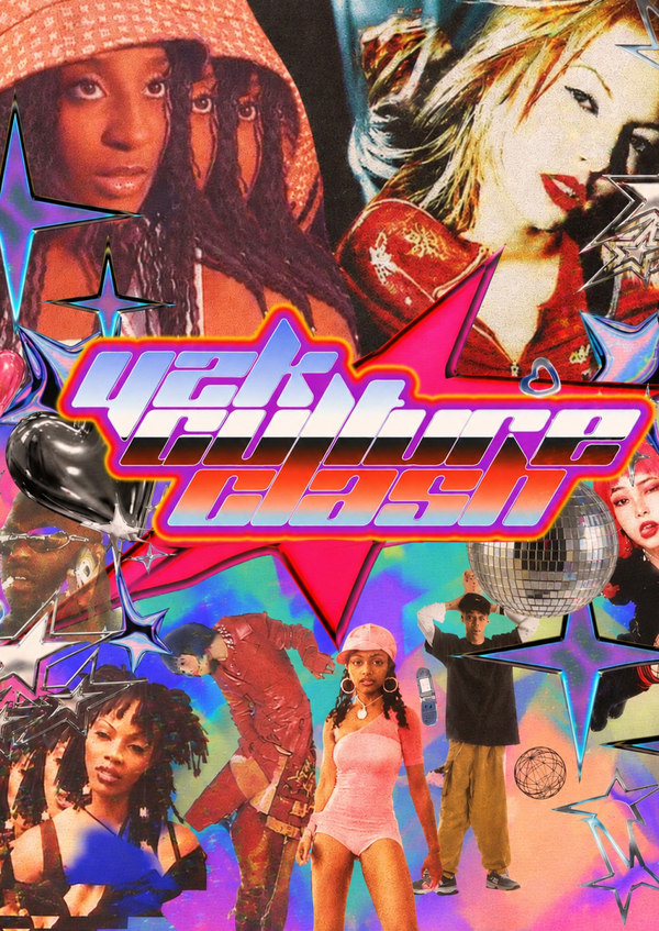
At the turn of the millennium, graphic design was obsessed with the future. Chrome, translucent colored plastic, glossy droplets, orbits, and broad «technological» typefaces appeared simultaneously on pop album covers, Winamp skins, mobile phone advertisements, video game packaging, and operating system interfaces. Today, this set of tropes is referred to as Y2K aesthetic, short for the year 2000. This study examines it not as a fleeting trend, but as a graphic language with its own history, grammar, and trajectory.
The chronological scope extends beyond the style itself. The image of the future was being shaped long before 2000: in Microgramma (1952) and Eurostile (1962) typefaces, in machine-readable OCR-A, in the film 2001: A Space Odyssey (1968), in the chrome and neon grids of the 1980s, and in the techno-graphics of the mid-1990s. Therefore, the work begins in the 1950s, with the main focus on the original Y2K period of 1997–2004 and its resurgence in the 2020s. The research centers on graphic design objects: album covers, posters, advertising, packaging, typefaces, skins, interfaces, websites, and game boxes. Each object is analyzed according to the same parameters: material, color, typeface, form, composition, and tool. Thus, a vocabulary of the style is constructed from disparate images, revealing how the chrome on a CD cover and a glossy button in an interface speak the same visual language. A separate thread concerns the tools. Photoshop layer effects, Kai’s Power Tools filters, early 3D programs, and Flash made highlights and metallic gradients accessible with a single click, and designers eagerly showcased the capabilities of this new technology.
Research Question: Why did the vision of the future, shaped by graphic design at the turn of the millennium, disappear by the late 2000s and return twenty years later, and how did its meaning shift—from belief in technology to nostalgia for that belief?
Hypothesis: Y2K disappeared when technology stopped surprising us, and it returned when technology started to frighten us. Now, it’s not an image of the future—it’s a yearning for belief in it.