ArtNavi Brand Effectiveness Assessment
Overall Evaluation Structure
Brand Communication Image.
Emotional and Value Connection.
Functional Utility of the Platform and Services.
Uniqueness and Positioning.
User Experience (Online and Offline).
Visual Identity.
Reputational Potential.
Economic Indicators.
Module Effectiveness:
9.1 Art Audit
9.2 «Inner Horizon»
9.3 Overall Urban Art Environment (Art Points).
ArtNavi Composite Brand Diagnosis using the Jean-Noël Kapferer methodology (Brand Identity Prism).
BRAND POSITIONING RECOMMENDATIONS.
1. ⭐ ArtNav’s Communication Persona.
What works well:
— A clearly defined mission: connecting people and culture within the urban environment. — Clear meaning: the concept of «navigating art in the city» is immediately understandable. — It forms the image of a modern, cultural, and technological platform. — The inclusion of modules reinforces the feeling of a well-thought-out ecosystem.
What needs improvement / what reduces effectiveness:
— The ArtNavi platform speaks a lot, but not always with a consistent voice across all descriptions. — Terms like «Art Points, ” „platform, ” „services, ” „utilities, ” and „art audit“ have not yet been integrated into a unified narrative for external audiences. — The brand is complex to explain initially: its multilayered nature might deter unprepared users.
Conclusion:
The communication foundation is strong, but it requires crystallizing a single focal message that will be consistent for the government, B2B partners, and end-users alike.
2. ⭐ Emotional Connection.
What resonates:
— The brand evokes a sense of accessible, democratic, and open art. — ArtNav is perceived as a project that improves urban life (it holds high emotional capital). — Users activate the feeling, «I can be creative, too.»
What needs improvement:
— The emotional image is not yet sufficiently supported by visual narratives, examples, or real-world case studies. — The «Inner Horizon» and ArtNav modules are conceptually strong, but they lack an easily digestible emotional framing.
Conclusion:
The emotional potential is immense, but it must be unlocked through storytelling, authentic human narratives, and strong visual formats.
3. ⭐ Functional Utility of the Platform and Services.
What is working:
— ArtNavi truly addresses three real needs of the city: — accessible cultural navigation, — digital services for creative communities, — developing the urban art scene through Art Points. — The ArtAudit service is an innovative product that meets the needs of businesses and municipalities: cultural environment assessment, route tracing, and visual practices audit.
What needs improvement:
— At the current stage, it may not be entirely clear to the user what they are receiving «right now.» — A clear structure is needed: — Platform → set of services → individual offerings. — ArtAudit requires demonstrations of specific case studies to be perceived as a tangible tool rather than just a concept.
Conclusion:
The brand is functionally strong, but a clear product language is necessary to explain exactly what individuals, businesses, and the city are gaining.
4. ⭐ Uniqueness and Competitive Positioning.

What we like:
— There are no direct competitors at the level of «urban art navigation + digital platform + auditing + points of engagement.» — ArtNavi fits into the trends of the creative economy, urban environment, AI culture, and the 15-minute city concept. — ArtAudit is a unique service offering.
What we dislike:
— The uniqueness has not yet been articulated loudly enough. — In the public sphere, the brand is perceived as a «cool idea, ” but not as a sustainable system. — We need to more clearly differentiate ourselves from: urban cultural projects, tourism services, artist services (which are niche).
Conclusion:
The uniqueness is immense, but it requires a refined formula that can be instantly grasped.
5. ⭐ User Experience (Online and Offline).
What I like:
— The concept of offline Art Spots provides people with a real, tangible experience. — The online services create a sense of flexibility and digital convenience.
What I dislike:
— There is no finished interface yet, so the UX is only perceived theoretically. — The platform’s complexity could confuse the user without a well-crafted onboarding flow.
Conclusion:
Offline plus online is a strong combination, but the UX architecture must be as simple and friendly as possible.
6. ⭐ Visual Identity.
What we like:
— The modern sound of the ART-NAVI name. — The clear association: «navigation through art.»
What we dislike:
— The brand style is still searching for a definitive look (color, graphics, AI visuals). — ArtAudit requires its own visual language to underscore professionalism and systematic rigor.
Conclusion:
The brand is visually recognizable, but it requires refined identity guidelines for all modules.
7. ⭐ Reputation and Trust.
What is appealing:
— The brand is built on the values of culture, openness, and social impact—a high level of trustworthiness. — Participation in HSE, ASI, and Creative Generation programs strengthens the status.
What is lacking:
— There are currently no public case studies that build «social proof.» — There is a shortage of testimonials, media mentions, and official partnerships.
Conclusion:
The potential for trust is high; the next step is to transition from concept to reputational assets.
8. ⭐ Economic and Strategic Indicators.

What we like:
— A logical monetization model: services, consulting, B2B, B2G, SaaS. — Flexibility: the ability to scale both geographically and by segment.
What we dislike:
— The lack of initial financial validation (this is natural for a startup). — The price point for ArtAudit is not yet supported by market case studies.
Conclusion:
The economic potential is strong, but it is crucial to gather the first data points—through pilot projects, testing, and financial modeling.
9. ⭐ Platform Module Effectiveness.
9.1. Art Audit Service
What we like:
— The unique nature of the service. — The huge potential for collaboration with developers and municipalities. — Analytical foundation + cultural audit = a rare combination.
What we dislike:
— The service requires a standardized methodology that is easily understood by the client. — A visual reporting format is needed (metrics, diagrams, maps).
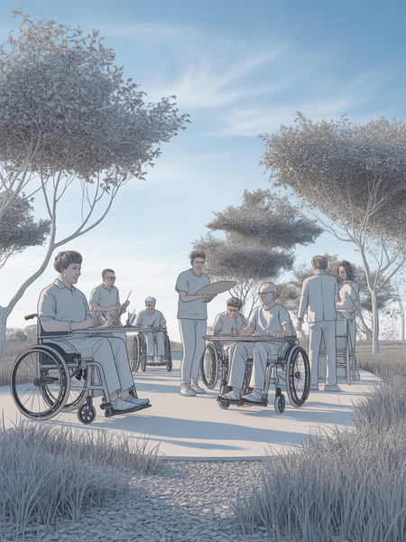
9.2. «Inner Horizon» Module
What I like:
— The strong humanitarian and psychological component. — The project enhances the brand’s value profile: culture as a space for inner growth.
What I don’t like:
— It is difficult to explain the module without a visual narrative and examples. — Clear application scenarios are needed: for whom? how? for what purpose?
9.3. Art Points
What we like:
— Instant visual recognition. — Tangible change to the urban environment. — High level of citizen engagement.
What we dislike:
— Real-world pilots will be needed to demonstrate effectiveness to municipal authorities.
🔥 FINAL CONCLUSION

The ArtNavi brand possesses significant strategic and emotional power, but its current effectiveness is constrained by a lack of unified communication formulas, visual standards, and demonstrable case studies.
In short:
Potential — 9/10, Current execution — 6/10, and this is normal at the beginning.
10. COMPREHENSIVE BRAND DIAGNOSIS: ArtNavi using the Jean-Noël Kapferer methodology (Brand Identity Prism).
Prism consists of 6 facets:
- Brand physical characteristics.
- Personality.
- Culture.
- Relationships.
- Reflection (how the brand sees its user).
- User self-perception (who the user is when choosing a brand).
1. Physical Characteristics (Physique).

What can be seen, touched, and described as a set of specific brand attributes.
Strengths:
— The ArtNavi platform as a digital navigation product: routes, maps, recommendations, and services. — Art Points—visually recognizable elements of the urban environment (fixed easels, art spaces). — Transparent service architecture: cultural routes, the artist’s personal dashboard, and business services. — The ArtAudit service—reports, analytical maps, and cultural profiles of territories. — The modern resonance and high memorability of the brand name.
Weaknesses / Areas for Growth:
— A lack of established corporate identity (colors, patterns, visual language). — The product currently lacks full implementations—a physical manifestation at the prototype level.
Conclusion: The brand’s physical layer promises scale, visual impact, and technological sophistication, but it requires formalization and pilot programs.
2. Brand Personality.