Пыльца — это газета, в которой публикуются новости из мира полевых растений для других растений.
Редизайн с помощью ии
«Пыльца» — это газета с новостями из мира полевых растений, созданная для самих растений. Она рассказывает о жизни поля, опылителях, цветении, сезонных изменениях и природных событиях. Проект превращает привычный мир растений в самостоятельную медиасреду со своим информационным пространством, характером и визуальным языком.
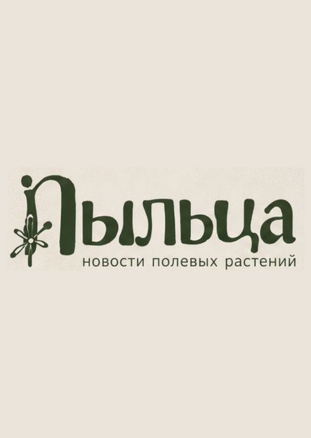
Логотип
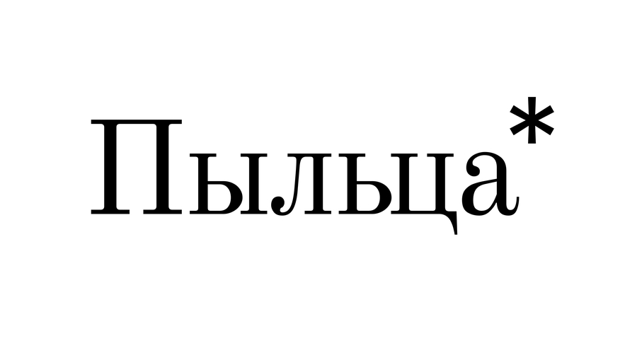
Design a distinctive logo for «Пыльца», a Russian newspaper for wild plants. Combine elegant editorial typography with a subtle botanical symbol inspired by pollen, wildflowers, or seeds. Create a refined, contemporary identity that feels like an independent nature magazine, not a flower shop. Use deep meadow green, warm cream, and muted pink accents. Clean composition, balanced lettering, memorable silhouette, high legibility, professional vector design. Keep the brand name exactly in Cyrillic: «Пыльца». No extra text, no distorted letters, no mockups.
Цветовая палитра
Шрифты
Графические элементы
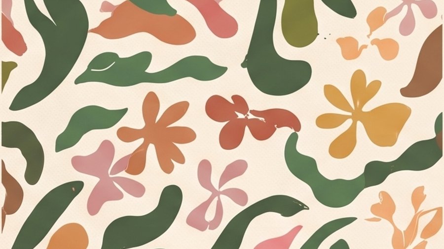

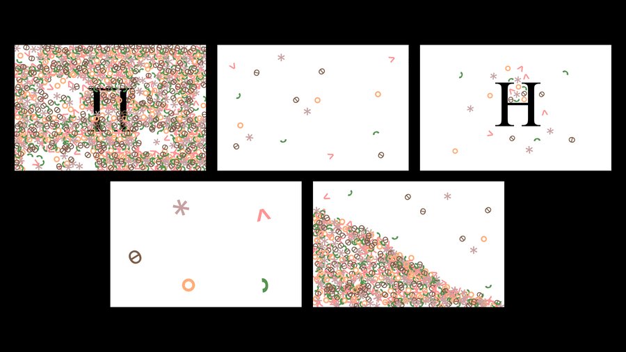
Create a cohesive set of seamless patterns and graphic elements for «Пыльца», a Russian newspaper for wild plants. Use an elegant botanical editorial style with organic silhouettes of wildflowers, petals, seeds, pollen grains, leaves, and delicate hand-drawn botanical illustrations. Combine flowing organic shapes with subtle vintage print textures and refined contemporary graphic design. Color palette: deep meadow green, warm cream, dusty pink, muted terracotta, soft peach, and mustard yellow. Include repeating patterns, isolated botanical symbols, decorative lines, icons, and abstract pollen-inspired shapes. Warm, natural, sophisticated, playful but not childish. Flat vector graphics, clean shapes, consistent visual language, professional brand identity presentation on a warm cream background. No mockups, no 3D, no gradients, no extra text. High resolution, crisp details.
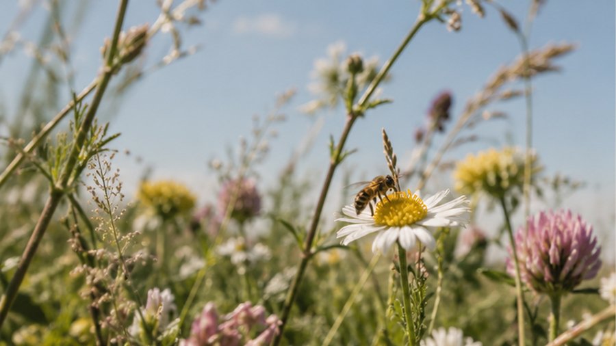
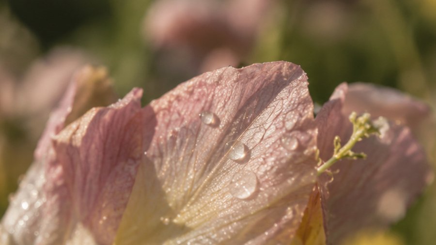
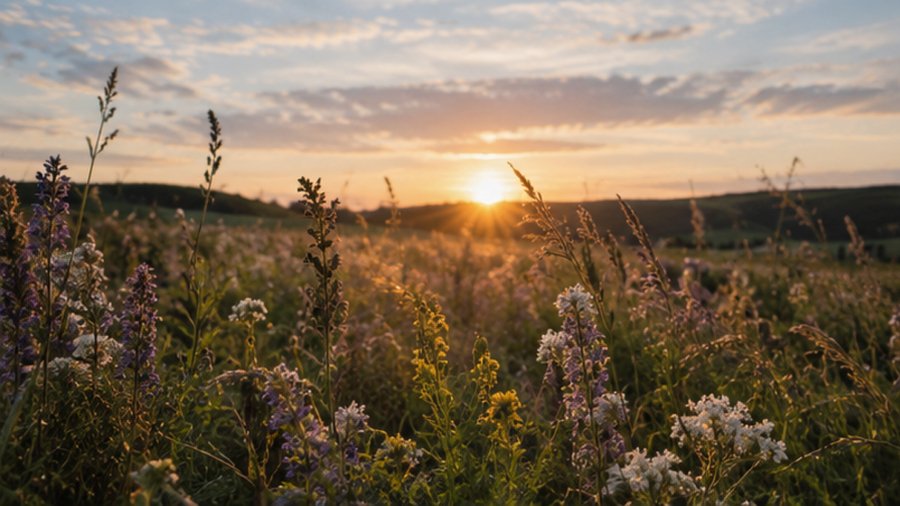
Фотостиль
Айдентика
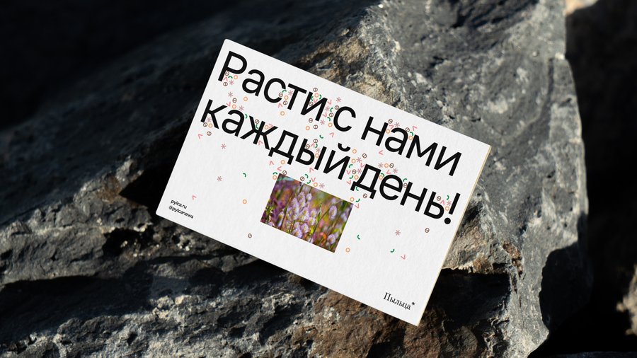
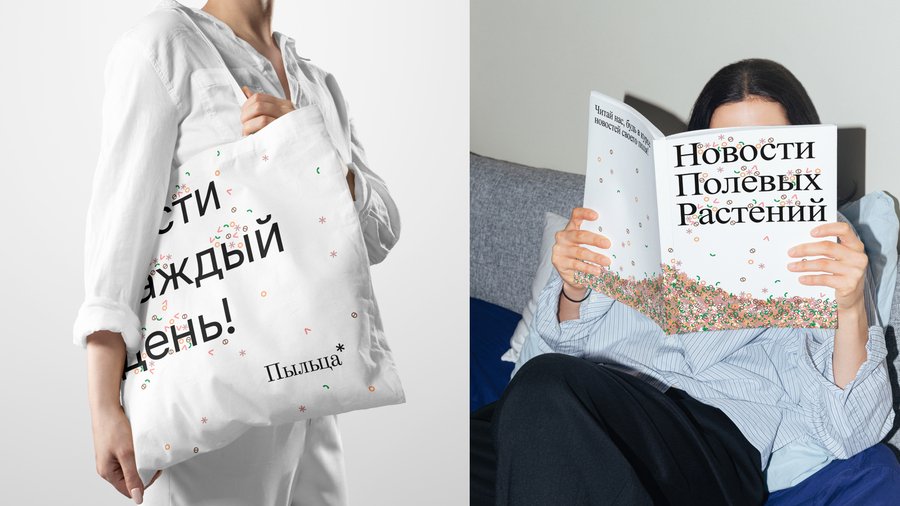
Create a complete visual identity system for «Пыльца», a Russian newspaper for wild plants. Develop a cohesive botanical editorial identity inspired by independent magazines, vintage print culture, wildflower photography, and the idea of a meadow as its own media ecosystem.Include the primary logo, alternative logo versions, a botanical symbol, color palette with HEX codes, Cyrillic typography, seamless patterns, graphic elements, icons, editorial layouts, newspaper covers, posters, social media graphics, and branded merchandise.Use a harmonious palette of deep meadow green, warm cream, dusty pink, muted terracotta, soft peach, and mustard yellow. Combine elegant editorial typography, organic botanical silhouettes, delicate hand-drawn illustrations, subtle paper textures, and contemporary grid-based layouts.The identity should feel natural, intelligent, distinctive, slightly nostalgic, and sophisticated, like a real independent nature publication. Balance expressive organic shapes with clear typography and structured editorial design. Present everything in a professional brand identity board with realistic mockups, consistent art direction, generous whitespace, and high-quality imagery.IMPORTANT: Keep the brand name exactly in Cyrillic: «Пыльца». Preserve correct lettering and readable typography. All visible text must be in Russian. No distorted letters, random text, childish illustrations, generic eco-brand clichés, or unrelated decorative elements. High resolution, crisp details, premium art direction, cohesive visual system.
Мерч и носители