Structure
- Research Concept
— I. Queen: 20 screens organized into four chapters
— II. Palace Square: 10 screens organized into two chapters
— III. Curatorial Study: 20 screens organized into four chapters
— Conclusion
— Bibliography
— Image Sources
Research Concept
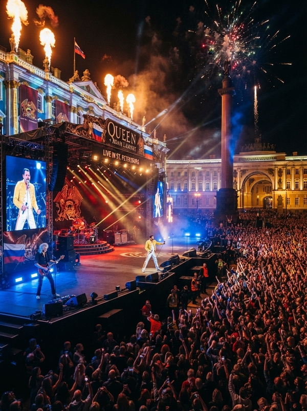
This study examines a hypothetical Queen concert on Palace Square as a visual translation problem: how can the stage language of the British band be related to a space that already possesses strong architectural and historical expressiveness? The focus is not on a list of Queen’s albums or a fantastical script of a real performance, but on the interrelation of three systems: Queen’s graphic identity, the collective behavior of the concert audience, and the urban stage of Palace Square.The work is structured as a small research book. Instead of fifty isolated reports, the material is gathered into ten chapters: four chapters on Queen’s history and visual identity (pages 1–20), two chapters on the historical formation of Palace Square and its transformation into a venue for mass events (pages 21–30), and four chapters on curatorial analysis and design (pages 31–50). The page numbers are retained as guides for the placement of images, diagrams, and captions; they do not denote fifty separate topics. The chapters are meant to be read sequentially, and the visual materials function as evidence, examples, and analytical models within a single narrative.How can recognizable Queen techniques—a central symbol, sharp contrast, theatrical shifts in musical moods, and audience participation—be translated into set design that accounts for the scale and historical specificity of Palace Square?Working Hypothesis. Queen’s visual dramaturgy can be correlated with the spatial dramaturgy of the square not through literal replication of emblems or projection onto palace facades, but through a compositional axis, shifts in scale, the rhythm of image appearance, and the transition from observation to collective action. This is a design hypothesis, not a conclusion about how a real production must necessarily look.
Initially, primary materials are analyzed: Queen’s official history and archive of performances, album covers and original sketches, museum descriptions, and historical images. These are then cross-referenced with academic studies on music videos, performativity, and musical dramaturgy. For the history of the plaza, materials from UNESCO, the State Hermitage Museum, the Presidential Library, the State Russian Museum, scholarly publications, and the Lenfilm catalog are used. Newspaper headlines from 2004, 2007, and 2009 are included as documents reflecting the perception of concerts at specific moments, rather than as neutral assessments of events. In-text citations refer to the numbered bibliography.The text is divided into three levels of argumentation. Dates, names, and event descriptions are accompanied by sources. Conclusions regarding the composition and significance of visual techniques are the author’s interpretation. Suggestions about the staging, graphics, and the viewer’s sightlines are designated as curatorial decisions. This delineation allows the project to be read simultaneously as a historical study and as a substantiated proposal, without presenting the imagined concert as an actual occurrence.
Queen’s History
Queen formed in London in the early 1970s around Freddie Mercury, Brian May, and Roger Taylor; John Deacon joined the lineup in 1971. Their debut album was released in 1973 [1; 2]. For a visual study, chronology is important, but so is the fact that the band began presenting itself as a cohesive unit quite early on. The public image was not reducible to a portrait of a single frontman: it encompassed the individual roles of the musicians, a collective name, and an emblem that could be carried across album covers, posters, stage materials, and souvenir graphics.
Mercury’s biography connects his early experience studying graphic design at Ealing Art College [3]. In the 1970s, this education became more than just a biographical detail—it helps explain why the band’s imagery was structured as a complete composition. The Queen emblem gathers the participants' zodiac figures, a crown, and a phoenix around the letter Q. Sotheby’s catalog publishes sketches related to the creation of this insignia [4], revealing the design process: individual figures coalesce into a hierarchy that possesses a center, a top, lateral supports, and an overall contour.
For further investigation, it is crucial to distinguish between a sign and its mechanical reproduction. The emblem is interesting here as a model of relationships: a central core holds the composition, symmetrical elements create balance, and a vertical figure directs the gaze. In the curatorial project, these relationships can be translated into a plan of the stage and screens, without reproducing the crown or the phoenix on the facade. This approach maintains a connection to Queen’s graphic style without turning the historical architecture into a backdrop for a corporate logo.
From an academic perspective, Queen is interestingly viewed at the intersection of musical style, theatricality, and stage persona. Nick Brae analyzes the band’s musical language and its genre contexts, while Grace Kate Odell’s work explores the theatricality, performativity, and identity of Queen [14; 15]. These studies suggest a method: analyzing not just «what is depicted, ” but also how form organizes the audience’s expectations, attention, and engagement.
The Evolution of the Queen Image in Media
The covers of Queen’s early albums illustrate how the band’s image was successively constructed through photography and graphics. The debut cover from 1973 reduces the composition to a lit face of Mercury against a dark field; the band’s official catalog documents the album and its visual materials [2]. The cover for Queen II, shot by Mick Rock in 1974, is structured differently: the musicians' faces are gathered into a rigid, symmetrical composition, and the black background enhances the separation of the figures from space [5]. This is no longer merely portrait photography, but rather a template for a stage persona that can be repeated and transformed.
In the «Bohemian Rhapsody» music video, Queen’s composition becomes kinetic. The official material from Queen links the video to the song released in 1975 and its director, Bruce Gowers [6]. The music consists of sharply contrasting episodes, so the visual material is not obligated to literally illustrate every lyrical image. Its function is to support the shifts in state—from a close-up portrait to a choral arrangement, from stasis to movement, from an intimate beginning to a grand final gesture.
Carroll Vernallis views the music video as an independent multimedia form where musical, lyrical, and visual codes interact with one another; Andrew Godwin also suggests analyzing musical television as a confluence of music, image, star persona, and mass culture [16; 17]. When applied to Queen, this means the music video should be read not as a «short film set to a song, ” but as a system of synchronization. Editing, camera angle, repetition, and contrast can emphasize, argue against, or create an additional layer of meaning for the musical transition.
For a hypothetical concert in the square, this principle is more important than a quote from a specific music video. If one song changes registers multiple times, the scenography can change the scale and density of the image along with it. Initially, the audience is presented with a simple contour or portrait, then the composition unfolds, and at the climax, it becomes wide and readable from a distance. This creates a temporal form, not a permanent decorative background. In this reading, the cover, the music video, and the stage are different ways to organize attention, but none of them should be transferred literally into the project.
Song as a participation script
In the album News of the World (1977), Queen’s visual identity achieves a fantastic, almost cinematic scale. Frank Kelly Fris’s cover transforms the musicians into heroic figures, placing human forms before a massive mechanical character [7]. This image aligns with one of Queen’s enduring characteristics: the band does not strive for documentary simplicity but constructs its stage presence through exaggeration, theatrical gesture, and the collision of different scales.
The scale in Queen doesn’t always imply image complexity. «We Will Rock You» is based on a repeating pattern of two stomps and a clap. The band’s materials state that Brian May wanted to create a rhythm that a large audience could sustain [8]. The simplicity here isn’t the absence of design, but its precise calculation. The action is easy to remember; it doesn’t require musical experience, and the synchronized movement of many people becomes part of the sonic composition. The audience stops being merely an observer and briefly becomes a participant in the collective rhythm.
This type of participation differs from active interaction with a screen or individual audience selection. It is synchronous and embodied: people repeat a simple gesture simultaneously with others, and the effect arises from the convergence of actions. For the curatorial concept, this example sets an important benchmark. In a public square, the audience does not need to be constantly entertained by graphic commands. It is enough to create a few clear moments where the music itself suggests comprehensible participation, and to support those moments visually with a large, rhythmically organized form.
Queen’s performance at Live Aid on July 13, 1985, is described in the band’s official chronicle as a separate, short concert slot [9]. In analysis, this event is significant not as a reason to declare the performance the «best» or «decisive, ” but as material for observing scale: the limited time demands an extremely clear sequence of gestures and songs. On the large stage, the audience perceives the artist, the mass audience, and the image transmitted by the camera simultaneously. These shots do not compete if the visual composition establishes a clear hierarchy among them.
Thus, within Queen’s musical language, two modes converge: an almost operatic shift in imagery and a minimal, unified rhythm. One mode creates a performance, while the other briefly gathers the audience into a single action. Their alternation will form the basis of the proposed dramaturgy, but the precise nature of the audience’s reaction in the hypothetical project cannot be predicted.
Film, tours, and transferring an image across countries
Queen’s work for the film Flash Gordon demonstrates that the band interacted not only with its own concert stage but also with the film’s visual world. The soundtrack was released in 1980; Queen’s official archive allows this material to be viewed within the context of expanding the musical identity beyond the album and the stage [10]. The science fiction genre builds recognition through scale, artificial environments, sharp contrasts, and recurring emblematic motifs. For research purposes, this is not a direct example of design, but rather another instance of how musical material can function within an already established visual universe.
In 1986, the group embarked on the Magic Tour. Queen’s archives document the dates and geography of the performances; this tour includes concert recordings, such as the performance filmed in Budapest, which later gained wide distribution as a concert film [11]. The scenography of the tour is viewed here as a system of long-distance reading: the large stage surface, the upper light contour, and the repeating visual accents allow the show’s integrity to be maintained for the audience, which views it from various distances.
The shift of the performance from a British stadium to Budapest is not important as a story of «conquering» new territory, but rather as an example of the transnational circulation of the concert image. The recorded performance transforms into a media object: the viewer who did not stand in the square or at the stadium can still see the montage, close-ups, lighting, and audience reaction. This confirms Vernallis and Goodwin’s idea that the musical image is formed simultaneously by the live performance and its screen transmission [16; 17].
The connection between Queen and the Russian audience also has its own documented history. The band’s official archives contain pages from performances in Moscow in 2008 and 2012 [12; 13]. A Kommersant article about the 2012 concert records the specific context of Brian May and Roger Taylor’s performance with Zemfira [29]. These events do not make the hypothetical concert on Palace Square a historical continuation of a real tour. Instead, they provide a more modest, yet useful context: Queen’s music had already penetrated the Russian concert scene through various lineups and formats.
Ultimately, the visual language of the group should not be understood as a single, immutable style. It shifts from album cover to music video, from film to stadium, from the artist’s emblem to collective rhythm. It is this capacity to switch between media and scales that makes Queen suitable material for a curatorial study—one where the question is not about copying the past, but about designing new relationships between stage, image, and place.
Palace Square: From Architectural Ensemble to Mass Event
Dvortsovaya Square was not originally conceived as a unified, grand composition. Its current wholeness evolved gradually as the surrounding buildings and the organization of space around the Winter Palace changed. The historical center of St. Petersburg is listed as a UNESCO World Heritage site as a cohesive complex, where individual monuments are perceived within the context of the layout and urban connections [18]. Therefore, viewing the square merely as an empty space between prominent buildings is insufficient; its meaning is created by the interplay of boundaries, passageways, facades, and the open center.
The Winter Palace in its current form is connected to the project of Bartolomeo Rastrelli and its construction in the mid-18th century; the official historical material of the Hermitage describes the stages of its creation and subsequent modifications [19]. In the early 19th century, Carlo Rossi designed the General Staff building and shaped the arched eastern boundary of the square. His arch links the palatial side of the space to the direction of Nevsky Prospect, while the grand arch establishes its own rhythm and scale. Together with the palace façade, it forms not a symmetrical room, but a charged, open space in which the viewer moves between different architectural poles.