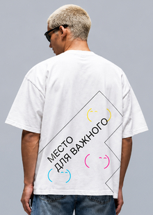
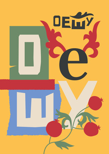
TYPE FOR THE MATTER — about the conscious selection of Cyrillic fonts. A typographic t-shirt from the «TYPE FOR THE MATTER» project. A large Cyrillic «Ж, ” baseline, and functional inscriptions transform the letter into the main image. The composition illustrates: the letterforms influence the character of the message. A small logo on the chest and large-scale graphics on the back continue the project’s visual language.
GRAPHIC AND TYPOGRAPHY
The letter becomes an image. The technical illustration shows its structure.

From both sides

Meaning
I adapted the concept of the «FONT FOR THE CAUSE» project onto a T-shirt. Usually, we perceive letters only as a way to convey text. I wanted to show that their form, scale, and placement inherently create an image and an atmosphere.
2 / GIVE THE LETTERS AIR
Line breaks and spacing transform a typographical rule into a visual image. The T-shirt reminds us: space affects readability just as letterform does.
03 / FIRST THE CONCEPT. THEN THE FONT.
Selecting the headset begins with the goal and nature of the message. A high-contrast, bold selection makes this principle the core content of the piece.
FROM THE COURSE SCHEDULE
MATERIAL AND APPLICATION
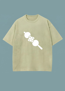
Oversized unisex t-shirt. 100% cotton. Weight reference: 220–240 g/m². Sizes S–XL.
EXACT LOCATION
FROM IDEA TO THING
DTG—Dark fabric preparation and white underbase—is in production. Without volumetric or metallic effects. This technology allows for the reproduction of complex full-color graphics and tonal details from photographs.