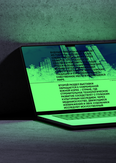
Website design is based on the central theme of the exhibition: a journey between the past and the future of South Korea, as presented by South Korean media artists. Through the lens of Korean philosophy, the exhibition explores universal questions of time, memory, and human existence.
The website structure supports this journey, bringing together works that look toward the past and the future.
The color palette bridges technological aesthetics with the atmosphere of a Korean summer. The acid green simultaneously evokes the digital environment and vibrant summer foliage. The dark blue conveys a sense of coolness, contrasting with the humidity.
The design evokes ideas of technological advancement and summery vibes, so acid green was used to embody technology and summer. Dark blue was used as a cooling color for the sweltering Korean summer (blue is associated with coolness by Koreans).
Strict, neutral typography supports the understated nature of the narrative and helps focus attention on the exhibition’s philosophical themes. A small monospace font used in captions and utility elements references digital interfaces, complementing the site’s technological aesthetic.