VHEEZE: COMMUNICATION THEORY
Communication theory in design
Communication theory in design revolves around the idea that design is not merely an aesthetic or functional task but a deeply communicative process that shapes and influences meaning within cultural and social contexts. According to Griffin (2009), communication is…
…«the relational process of creating and interpreting messages that elicit a response»…
… and design functions as a set of symbols — visual, textual, and experiential — that engage audiences in this interactive meaning-making.

«vheeze» brand logo
A compelling example of this in practice is the branding and communication strategy behind Vheeze, a next-generation vegan cheese brand. The brand employs a slightly ambiguous, playful communication style that sparks curiosity and engages the audience in a decoding process. Its slogan, «The cheese that grows, not milked,» cleverly plays on expectations and invites consumers to rethink traditional concepts of cheese, creating a cognitive pause that captures attention. This kind of «strategic ambiguity» aligns with communication theories emphasizing the power of symbols and meanings that are open to interpretation within specific cultural contexts (Craig’s Socio-Cultural and Semiotic traditions).
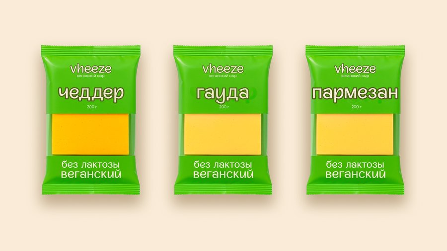
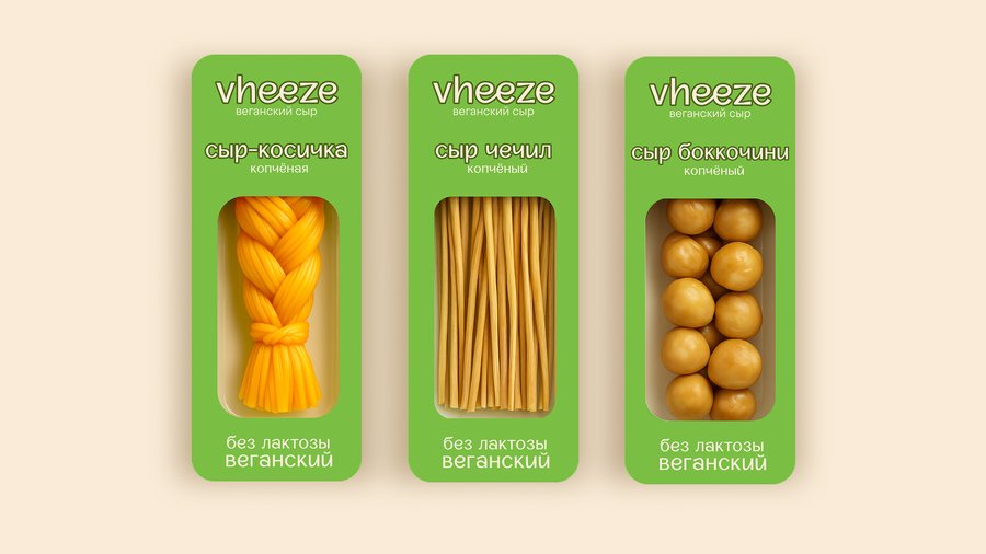
«vheeze» branded packaging
Moreover, Vheeze’s communication is layered: it oscillates between the familiar and the novel, entices through wordplay («not 'moo, ' but 'wow'!»), and combines emotional appeal with rational messaging about ethics and taste. This corresponds with the Rhetorical Tradition, where persuasion is achieved through the interplay of speaker identity, message style, and audience perception. The brand’s communication is not straightforward but rather invites the receiver into a dialogue—an aspect central to Interpretative Communication Theory—which cultivates engagement and community identity.
In sum, through Vheeze, we see how communication theory enriches design by positioning it as a dynamic, dialogical process. The brand’s slightly perplexing, flirtatious messaging is not accidental but a designed feature fostering meaningful interaction, encouraging consumers to actively interpret, relate, and form identities around the product. This exemplifies the practical power of communication theory in contemporary design practice.
Mall branding
Presentation for a general audience
Vheeze is a vegan cheese brand born not from market research or corporate strategy, but from a personal longing. The creator has been vegan for 10 years — not out of dogma, but out of genuine care for animals and the planet. Yet there was one thing she couldn’t let go of: the memory of cheese braids, a beloved childhood food that seemed incompatible with ethical living.
«vheeze» brand slogan
Vheeze is plant-based cheese that genuinely tastes good. Not «good for vegan cheese.» Not «surprisingly good.» Just good. It melts. It stretches. It satisfies. It comes in varieties that honor traditional cheese forms—braids, sticks, pearls, blocks—while being entirely free from dairy, lactose, and animal products. The promise is simple: • No compromise on taste • No animal suffering • No lactose for those whose bodies reject dairy • Only plants, carefully crafted into something delicious
visualization of the «vheeze» brand point of sale
Who is it for?
First and foremost: Vegans and vegetarians who remember what traditional cheese tasted like and want that memory back without the guilt. But also: • People with lactose intolerance who’ve been told they can’t have cheese — now they can • Curious omnivores who want to try something different without abandoning their diet entirely • Parents or friends buying for vegan or lactose-intolerant children, or simply wanting to introduce more plant-based options to family meals • Anyone who wants cheese without the ethical weight — because honestly, the dairy industry is complicated, and some people just want an alternative
visualization of advertising materials for the «vheeze» brand in the environment
If Vheeze were a person at a dinner party, it would be: Friendly — No judgment about your diet choices. No lectures about why you should be vegan. Just: «Want to try this? It’s really good.» Aware — Vheeze knows exactly what it is: a plant-based cheese created with intention and care. It’s not pretending to be traditional dairy; it’s confidently being something new. Playful — Life doesn’t have to be serious. «Not 'moo, ' but 'wow'!» captures it perfectly. There’s humor in the contradictions, joy in the discovery, lightness in the approach.
Presentation of Vheeze brand for a professional audience (designers)
For designers, Vheeze can be presented through precise visual and theoretical language, focusing on color, symbols, form, and typography within semiotic, socio-cultural, and critical traditions.
visualization of the tasting point for the «vheeze» brand
Concept and form
Vheeze operates as a cultural legitimizer of plant-based cheese in mainstream gastronomy, recoding vegan products from a symbol of restriction into a symbol of gastronomic pleasure and ethical normality. Semiotic sign transformation occurs when plant-based cheese stops signifying «replacement for the real thing» and starts signifying «another legitimate way to experience cheese culture, ” resolving the tension between vegan ethics and culinary nostalgia.
Color palette
«vheeze» brand color palette
A warm palette (creams, ochres, soft greens) references artisanal food culture and heritage gastronomy while aligning with contemporary codes of sustainability and craft. This places Vheeze at the intersection of comfort-food nostalgia and ethical modernity, avoiding the clinical or punitive visual language often associated with «healthy alternatives.»
Visual symbols & language
«vheeze» t-shirt
The name «Vheeze» and wordplay slogans form a linguistic-visual system where humor and slight ambiguity create cognitive friction and memorability. From a critical perspective, this gently critiques guilt-based vegan communication, proposing instead an ethics of joy and cultural literacy through playful verbal and visual codes.
Typography & brand character
Friendly, slightly playful typography with human-centered proportions positions the brand as contemporary yet gastronomically credible, closer to editorial food culture than to «functional diet» packaging. In interpersonal terms, the brand voice behaves as a culturally literate, relaxed friend who treats ethical eating as a sign of taste and awareness rather than moral superiority.
«vheeze» brand font
For designers, frame Vheeze as
semiotic intervention that recodes vegan cheese from «ethical sacrifice» into «legitimate gastronomic pleasure, ” using warmth, narrative, and ambiguity as primary tools. A socio-cultural experiment that tests how mainstream audiences integrate ethical values into everyday eating without abandoning comfort, nostalgia, or aesthetic pleasure.
design of the social network for the brand «vheeze»
Communication theory basis
«vheeze» cap
Communication theory serves as the foundation for the Vheeze brand’s communication strategy, providing a structured approach to crafting messages that engage and resonate with diverse audiences. Central to this foundation is the understanding of communication not merely as transmission of information, but as a dynamic process involving meaning creation, interpretation, and feedback.
Vheeze’s messaging draws heavily on semiotic theory, where every element — from the playful name «Vheeze» to the slogan «The cheese that grows, not milked» — functions as a symbol rich with cultural meaning. This semiotic layering invites the audience to decode and engage with the brand on multiple interpretive levels, making the communication more memorable and impactful. The slightly elusive, teasing nature of this messaging creates cognitive tension that captures attention and invites curiosity, in line with communication theories about audience engagement and message complexity.
The brand also integrates the Elaboration Likelihood Model (ELM), tailoring communication routes to audience types. For casual or new consumers, Vheeze uses peripheral cues such as appealing visuals, humor, and relatable language to create initial positive associations. For more analytically minded audiences, deeper informational content and ethical appeals serve to encourage thoughtful elaboration and trust-building.
Additionally, Vheeze’s communication leverages the Rhetorical Triangle — ethos, pathos, and logos — balancing credibility, emotional resonance, and logical appeal. The brand’s ethos is established through transparent, honest positioning; pathos through nostalgic and ethical motifs; and logos through clear rational benefits such as plant-based composition and taste fidelity.
Overall, Vheeze exemplifies communication theory applied to design by moving beyond aesthetics to become a strategic conversational partner, inviting consumers into an ongoing dialogue that challenges traditional food narratives while building community and identity around shared values.
Course «Communication Theory: Bridging Academia and Practice» [Electronic resource]. — Electronic text data. — 2025. Accessed 12.12.2025.
Shikova A. Educational project «Vegan cheese „vheeze“» [Electronic resource]. — Available at: https://hsedesign.ru/project/647e93f6bced4e528e577564dd5a1b9c (accessed 12.12.2025).
