Introduction & Approach
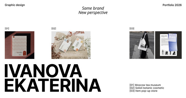
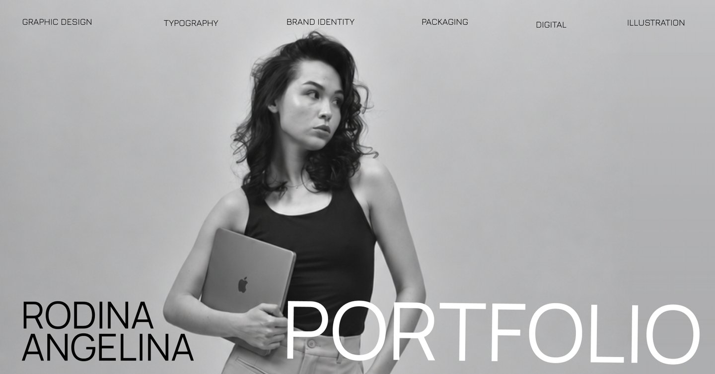
My name Angelina Rodina and I`m a graphic designer specializing in visual identity, packaging, and visual communications.I create cohesive visual systems for brands, independent projects, and individual clients — from logos and packaging to print and digital design.My approach combines visual metaphors, unconventional compositions, and expressive typography.
Packaging
UGLIK
is a brand of eco-friendly household cleaning products, inspired by the riches of Siberia, with charcoal as one of its key ingredients.Its minimalist packaging and understated, calm aesthetic allow it to blend perfectly into any interior.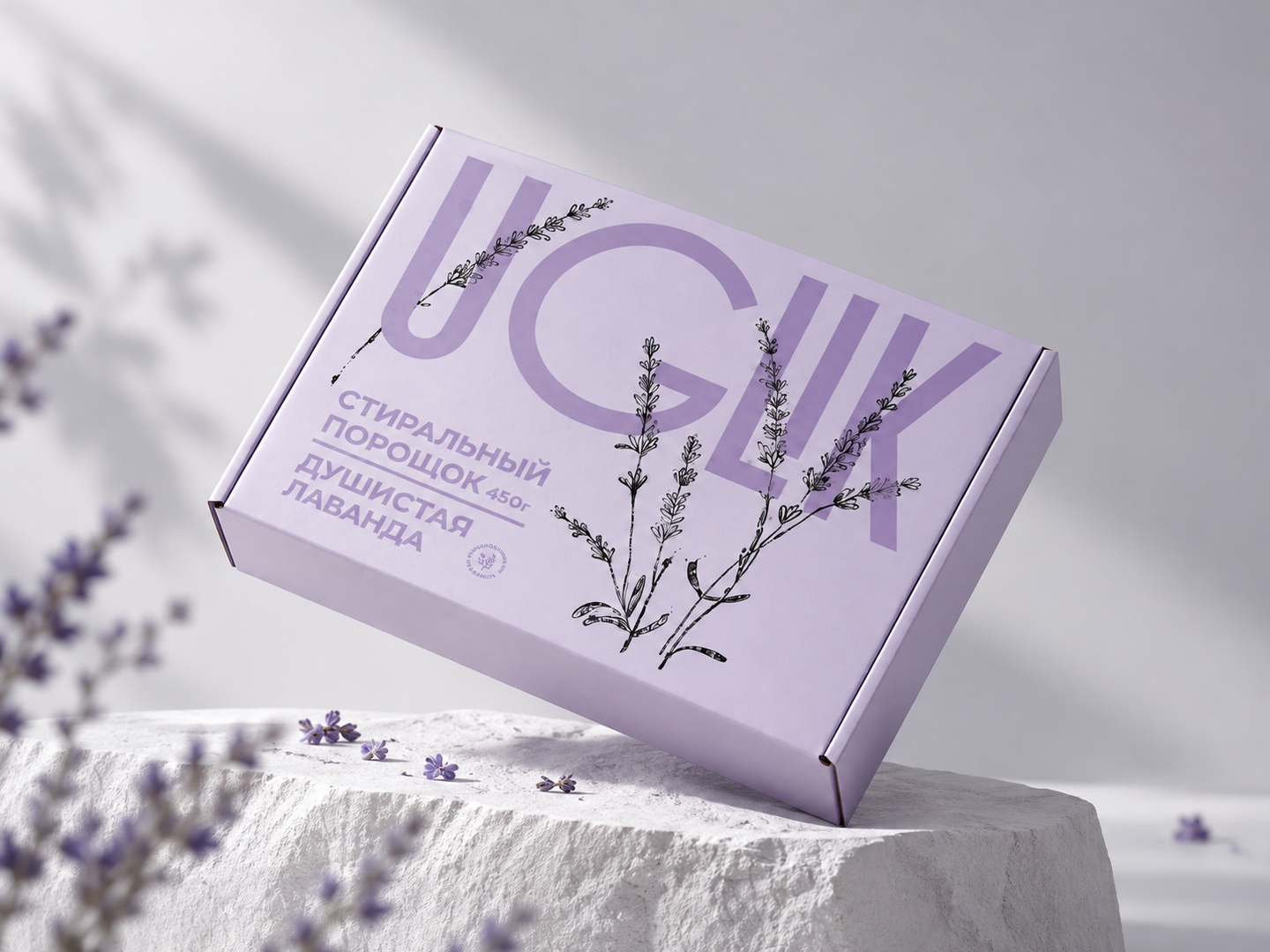
Brand identity
«Charlie & Co»
Grooming boutique where pet care becomes a delightful ritual.We offer professional grooming, a comfortable, home-like atmosphere, and a personalized approach—ensuring every furry friend feels calm, safe, and looks their absolute best.The central element of the visual style is large-scale typography—specifically, verbs.
In this way, the user perceives not just a service, but a sense of care and the sequence of steps their pet will experience during the service.
Online school «Chess Orbit»
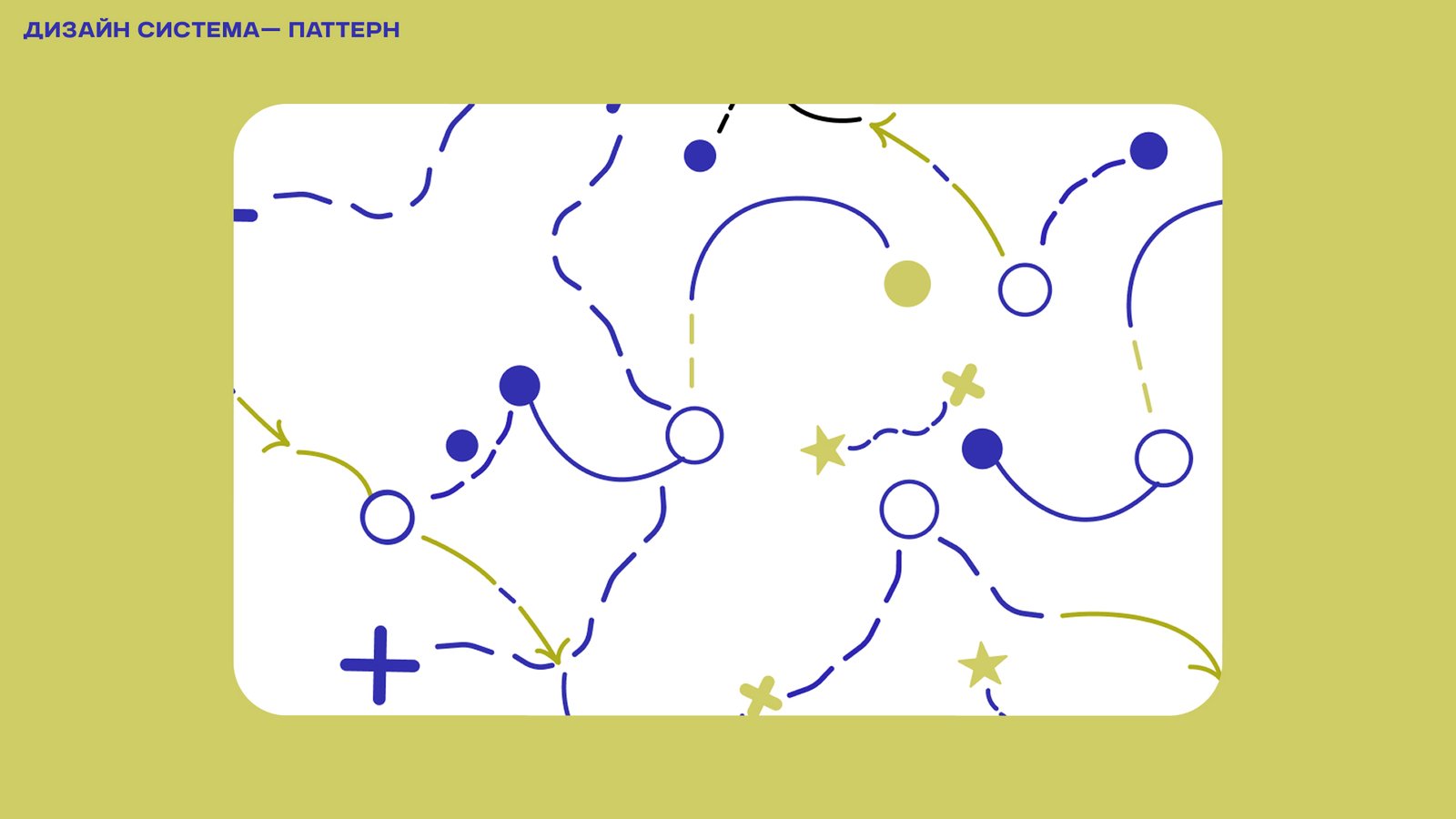
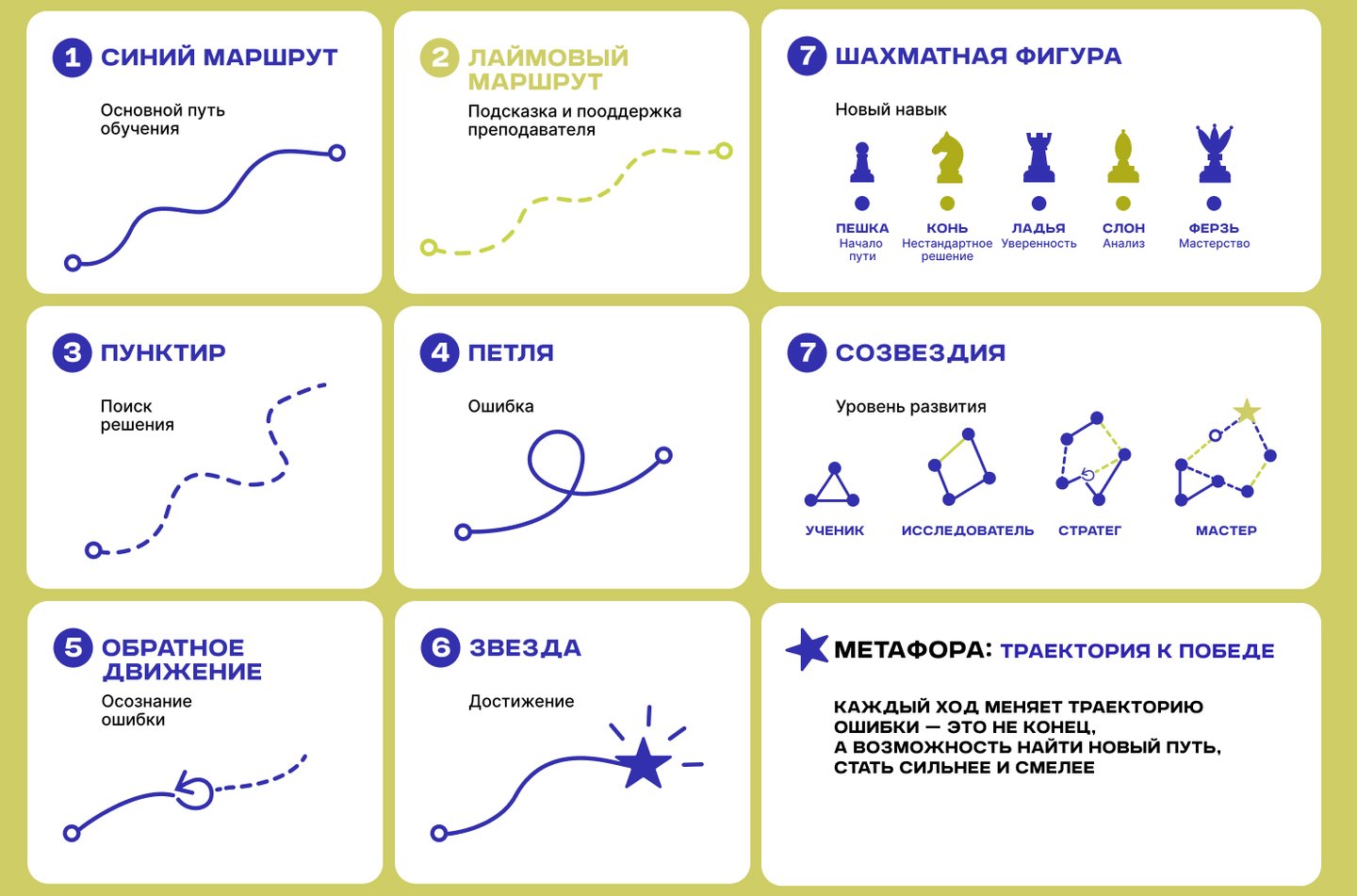
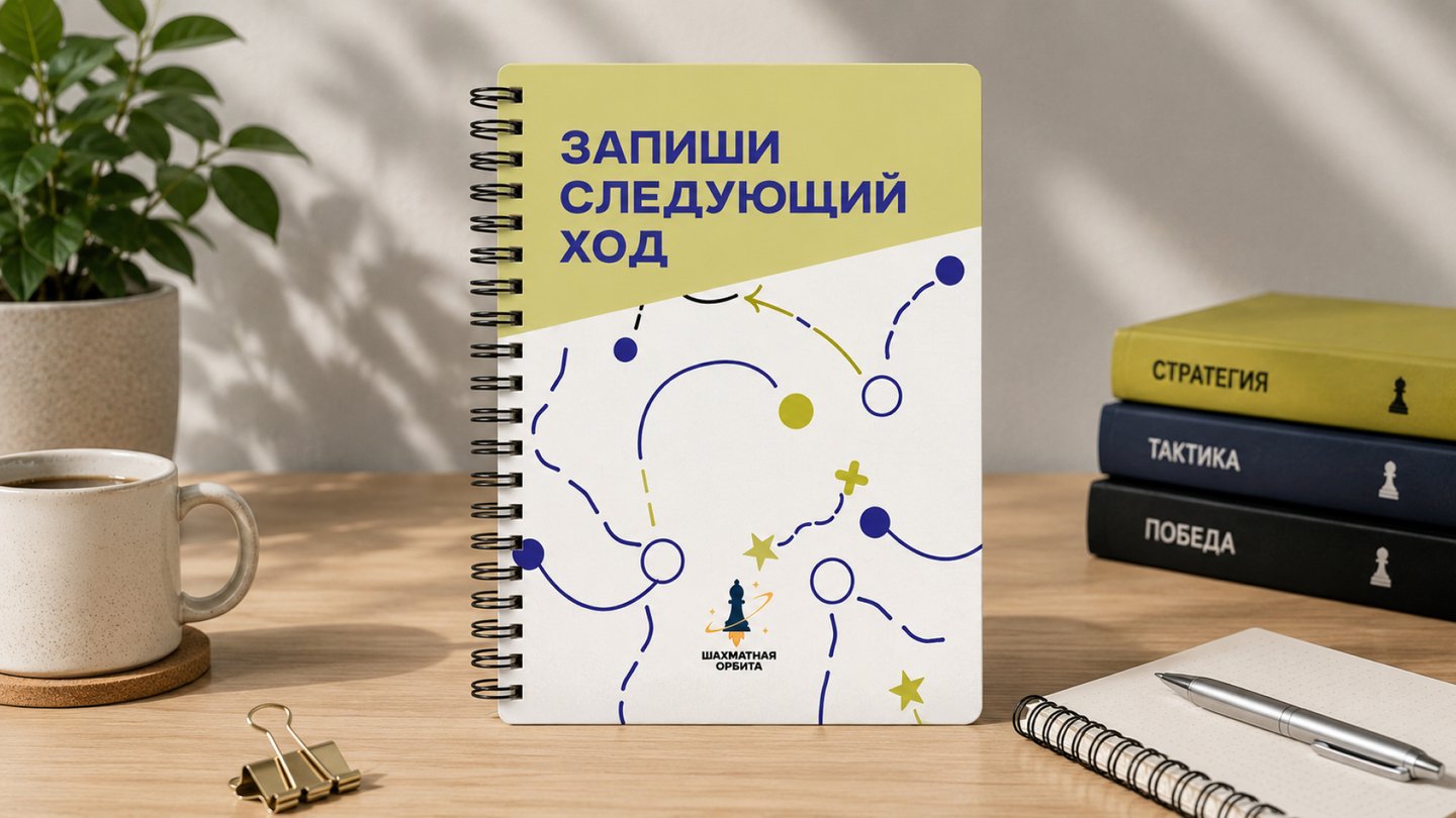
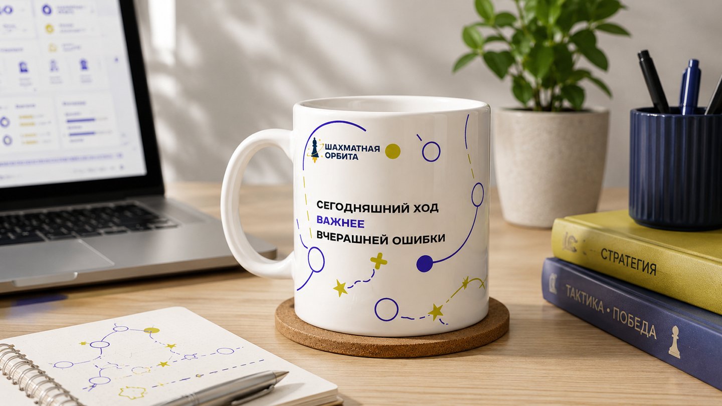
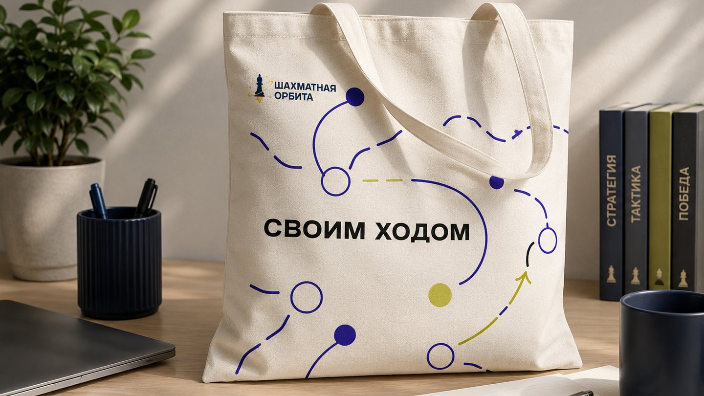
«Chess Orbit» is an online chess school built around the metaphor of a trajectory toward victory.Every move becomes part of one’s development journey, while mistakes are viewed as points of growth along the path to new achievements.METAPHOR
The Trajectory of Victory
Much like the flight of a rocket, a child’s journey toward a goal requires constant course correction. Mistakes are not obstacles, but rather part of the route—a means to grow, learn, and keep moving forward.
Chess is viewed not merely as a game, but as a tool for developing critical thinking, independence, and a strategic perspective on the world.
Illustration