ABOUTI’m Katrin. I design websites, digital products, and brand identities that help businesses capture attention and clearly articulate their value proposition. I connect a distinctive visual concept with a clear user journey: what people notice, what they understand, and what action they can take next.MY APPROACH[1] Clarity. You can come to me before you have a finished brief. I review your existing materials, ask focused questions, and help define the problem and the decision your audience needs to make.[2] Depth. I work with the available data about your customers: what they ask, where they hesitate, and what helps them make a decision. If something essential is missing, we identify what needs to be clarified before it shapes the design.
TSAREVNA-PENKA
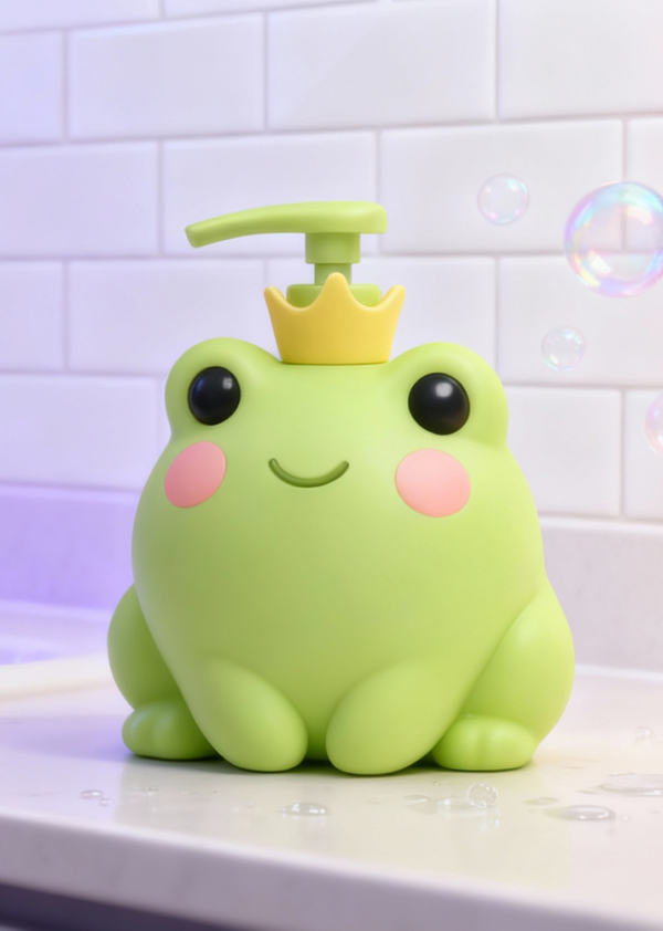
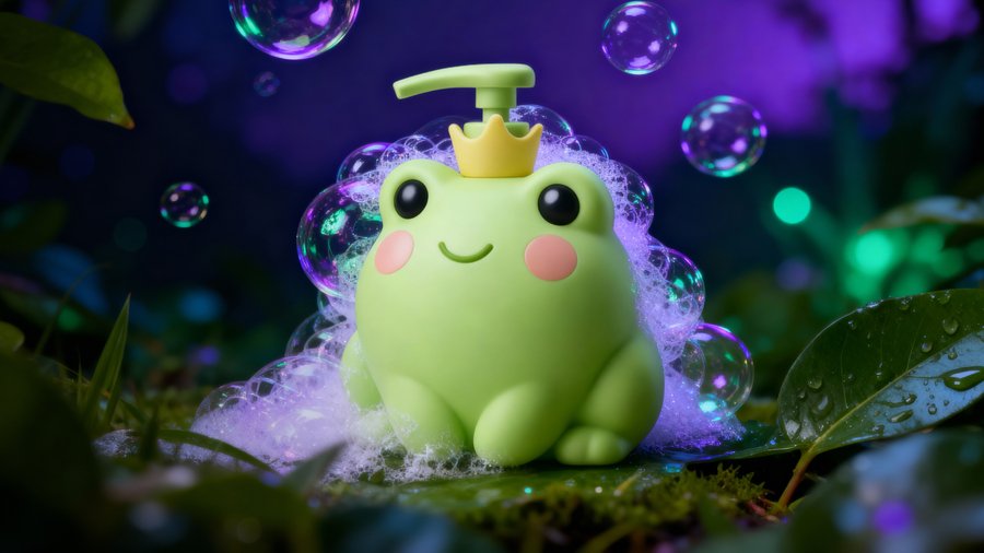
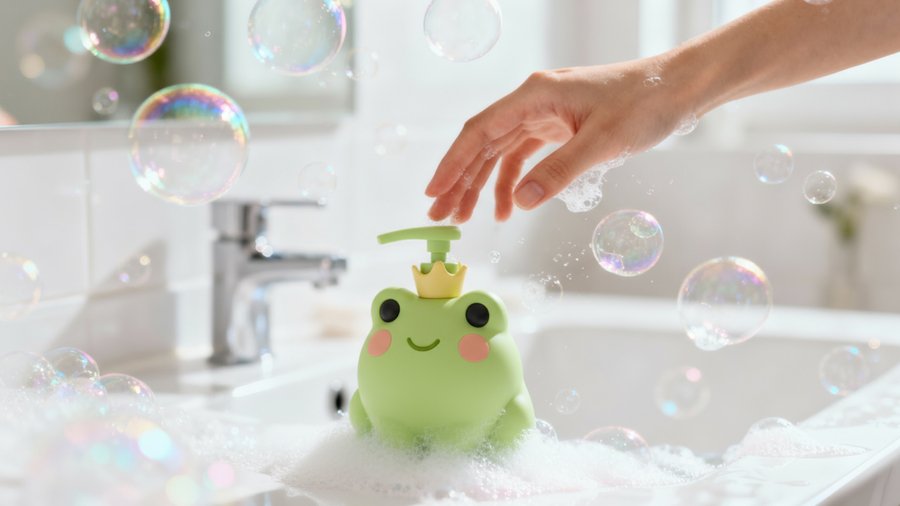
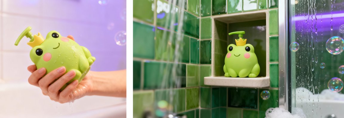
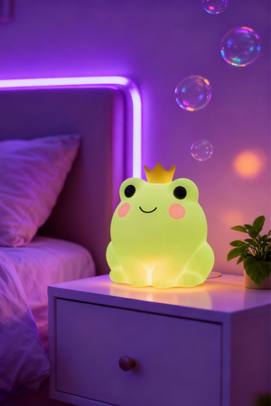
Task. Design packaging for children’s soap that captures a child’s attention and retains utility after the soap is used up. The concept also required designing a bottle that would not break if dropped.Solution. The bottle is shaped like a crowned frog. A pump dispenses foam, and the packaging is also designed to be an object a child can play with. Once the soap is gone, an LED insert can be placed inside the empty bottle to serve as a night light.Result. The project resulted in a brand and a bottle concept with dual functions. A post about it garnered around 700 views, despite the channel having fewer than 200 subscribers; a community page also shared it. Approximately 15 people messaged to inquire about purchasing or developing similar packaging.
DEAF CLUB
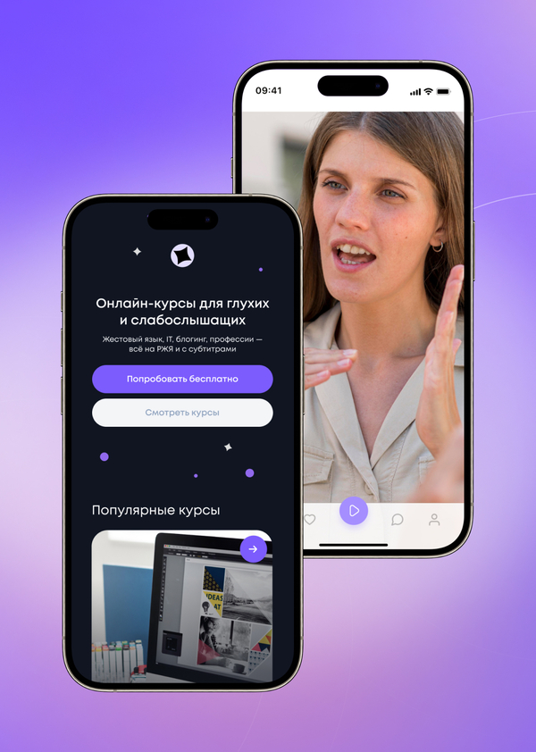
Task. Design a website for a social impact startup that connects people through sign language. The website, app, and brand required a visual language in which Deaf individuals could see themselves reflected, rather than feeling that the design was created for them from an outside perspective.Solution. The central metaphor was space: an environment without sound, where light and movement convey meaning. This concept unified the visual designs for the website, app, logo, and merchandise. Within this system, sign language occupies a natural place rather than being presented as an anomaly.Result. Cohesive visual designs were developed for the website, app, and overall brand materials.
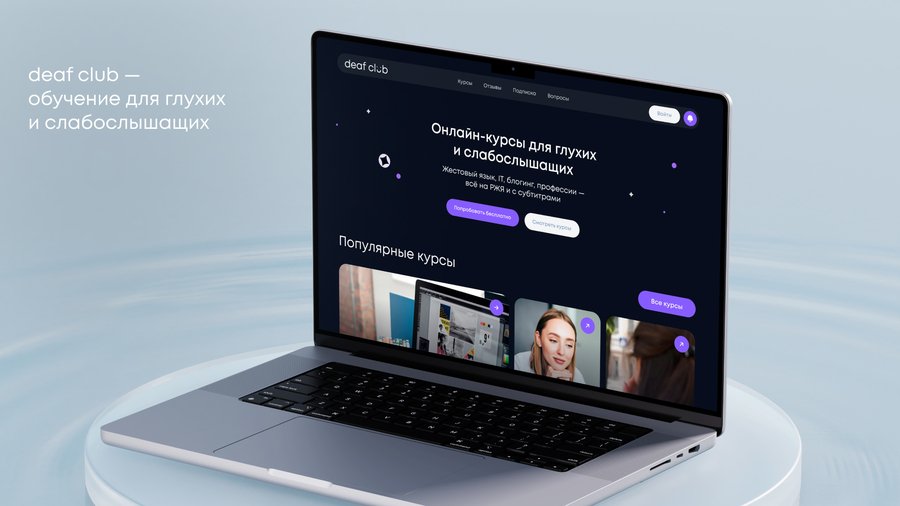
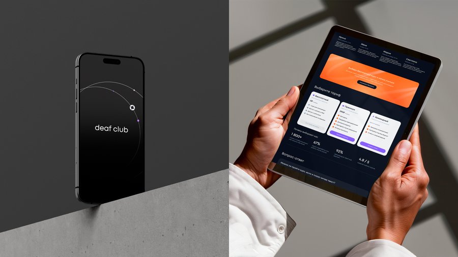
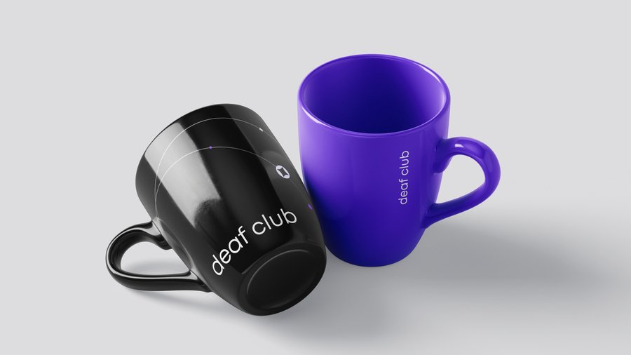
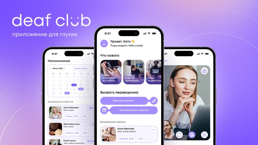
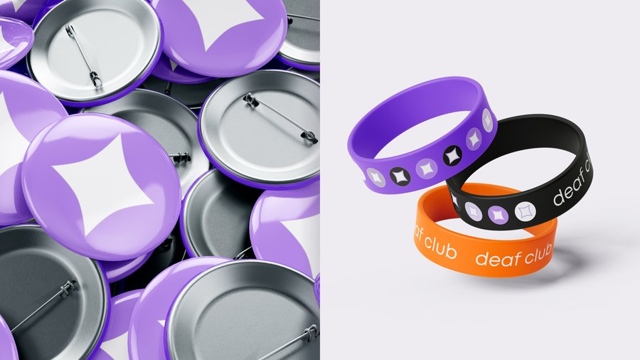
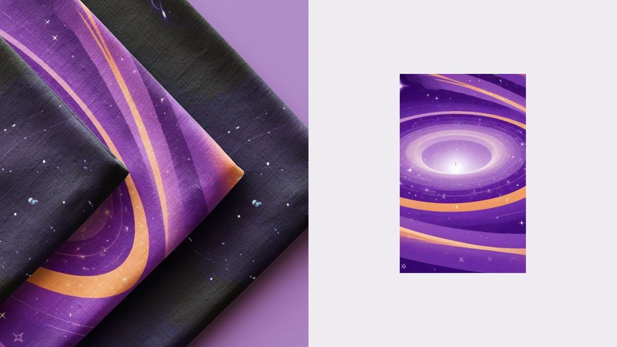
The project as a whole was a finalist at the DAFES AWARDS 2025 in the Interface and Mobile Applications categories.
OFFERISTY 3.0

Task. Redesign the website for a career course on finding employment in Russia and internationally. The course creator felt the previous color palette evoked anxiety and that the site presented the course impersonally. After enrollment, students navigated within a standard GetCourse interface.Solution. The references to office life and professional careers were retained, but the site’s color accents, visual rhythm, and structure were overhauled. Instead of one continuous block of text, visitors can now easily find out who teaches the course, what they will study, and how to apply. The GetCourse pages were redesigned, from the homepage through to individual lessons, incorporating separate entry points for modules, live sessions, and student support.Result. The course achieved a distinct new website and a deliberately designed learning environment. Its Summer 2026 cohort sold out while the new website was live.
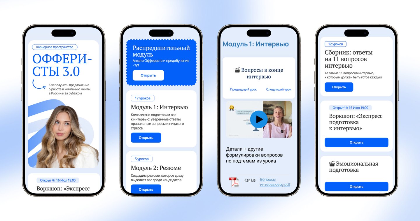
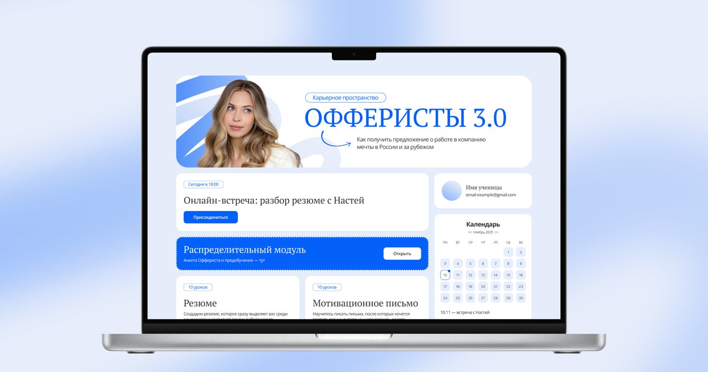
CHINA TRADE SCHOOL
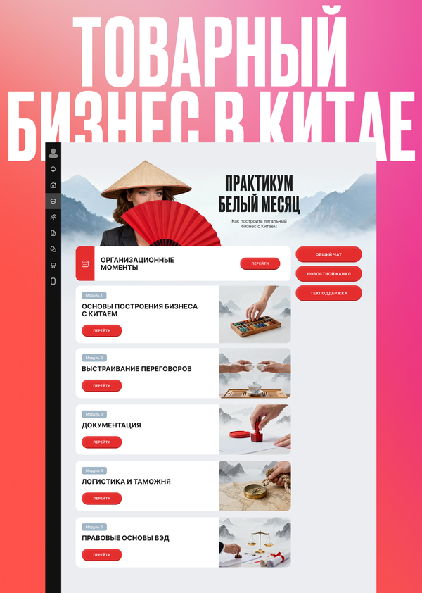
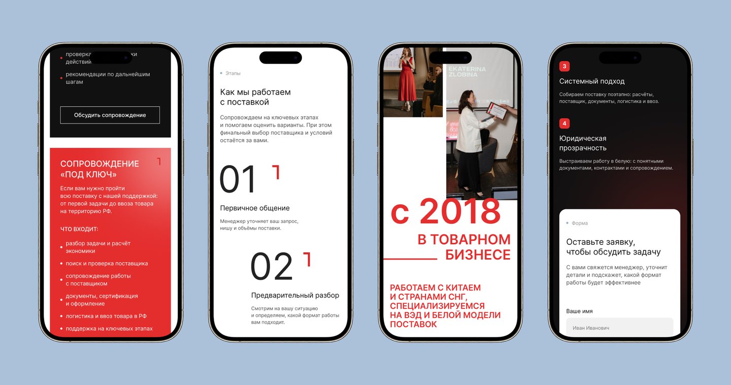
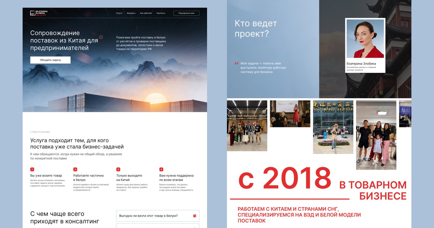
Task. Present the school’s new consulting service to business owners and redesign its guided course on GetCourse. The client outlined the service, but the website’s content and structure still needed to be developed from that brief.Solution. The information was organized around two user journeys. The consulting website explains which questions the team helps with, what the service entails, and how to inquire. On GetCourse, the guided course was redesigned, with its materials and lessons organized within the learning platform. The same visual elements were carried over into the school’s presentations and posts, complete with dark and light versions.Result. The work delivered a website for the new service, an updated GetCourse, and materials for presenting the school’s offerings. The consulting website was shared via personal invitations.
ROSA
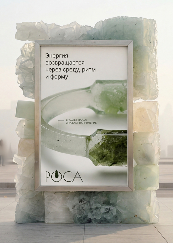
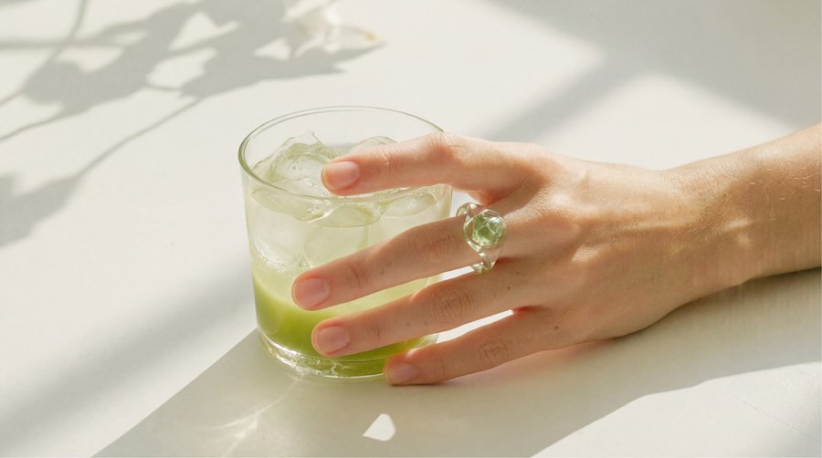
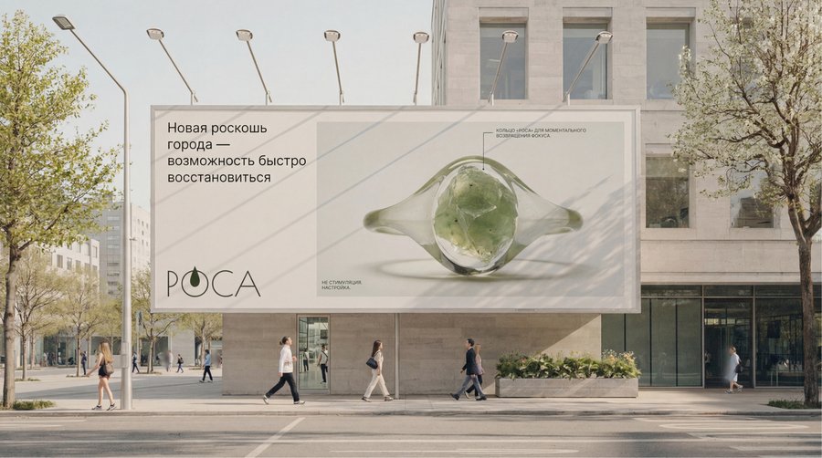
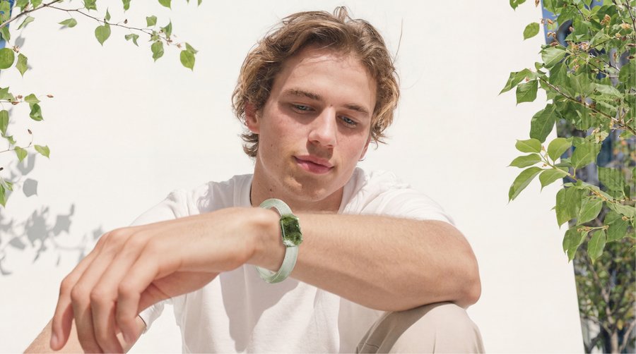
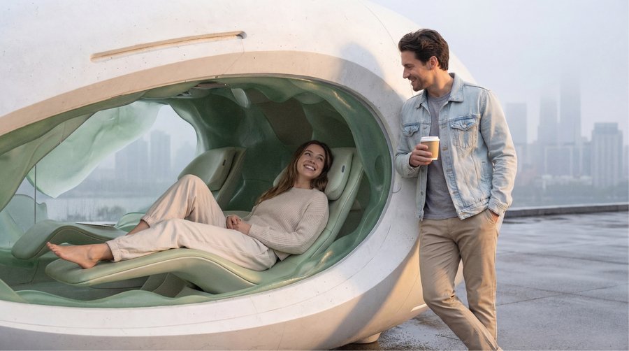
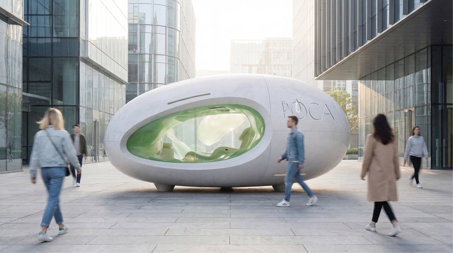
Task. Develop a strategy to promote a mineral jewelry brand. The concept of gentle renewal needed to extend beyond the jewelry line into city advertising and public spaces where people could engage with the brand.
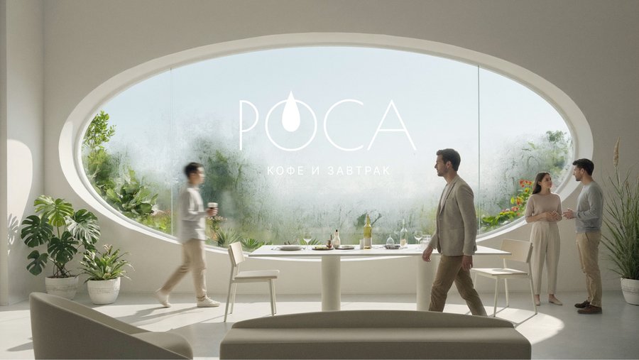
Solution. Mineral imagery and textures were translated onto billboards and posters, subsequently evolving into concepts for an outdoor rest pod, a reception area, and a café. The same visual principle was applied across different scales, from jewelry worn on the body to an object situated on a city street. The spatial concepts are demonstrated in visualizations created using AI tools.
Result. The project yielded a comprehensive promotion concept encompassing jewelry, outdoor advertising, and spatial installations. Mineral forms and textures were selected to give the brand a distinct presence within the urban environment. The pod, reception area, and café currently exist as visualizations.
WORKING WITH ME[1] Business Focus. Before designing, we align on the assignment and establish criteria for evaluating the final work. This ensures that all content, structure, and visual decisions have a clear purpose.[2] Reliability. We establish the project stages, review milestones, and feedback loops. Throughout the project, I provide regular updates on progress, flag decisions requiring your input, and outline the next steps.
LET’S DISCUSS YOUR PROJECT
Need a website, digital product, or brand identity? Send me a link and a short description of what you want to change. We’ll schedule a call to discuss the task and the scope of work.
Email: tikatrin001@gmail.com Telegram: @kateti_katrin