Mariia Dymchenko — identity designer for startups and small brands.
I build brand identity as a system: from strategy and copy to the brand book and generative tools your team keeps using. A full cycle with nothing lost between strategist, copywriter and designer.
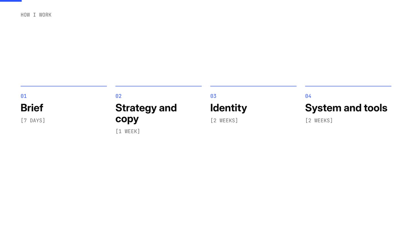
Selected work.
Three questions founders ask me — and three answers.
Hedonism Cycling — Can a label carry a feeling?
Branding | Packaging Design | Beverage
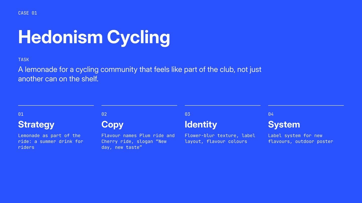
Task Hedonism Cycling is a [St Petersburg] cycling community. For [Bike Day on 3 June] they wanted their own non-alcoholic lemonade: a drink riders grab after a ride and keep as part of the club’s world.Idea A summer ride is a blur of colour. I took fragments of flowers and blurred them into a soft, grainy texture, like a landscape seen from the saddle.Solution The label has four fixed layers: a wide-caps brand line, a script flavour name over «ride», an info line and the texture band. A new flavour changes only the label colour and the name: Plum ride in pale blue, Cherry ride in warm beige.System The same parts scale to outdoor: on the «New day, new taste» lightbox the can becomes the hero and the texture becomes the ground.
Result The client received a label system for two lemonade flavours and an outdoor campaign concept, with a consistent visual identity that can be extended to future releases.
Engine11 — Can a brand have its own voice?
Type Design | Lettering | Cycling Culture
Task Give a brand a voice that can’t be downloaded from a font library. Idea Straight strokes, cut corners and a mechanical rhythm: a display face that sounds like a machine and reads like a headline.
Result An original display typeface, in use on the 2025 bikelife poster, club posters and merch.
Beride Gel — Will the brand work on every touchpoint?
Packaging Design | Illustration | Sports Nutrition
Task A limited edition of Beride energy gel for a cycling camp in Nice and Bike Day on 3 June: one identity for the pack, the riders and the event. Idea Real fruit on technical foil. Detailed fruit illustrations on a silver tube make the gel feel natural and fresh, while the foil and heavy type keep it performance-grade. Solution Heavy condensed type takes half the tube, so the name reads from a jersey pocket and from a photo. Three flavours — Pear & Kiwi, Orange & Fig, Lemon — share one layout. The tube was built as a 3D model, and key visuals were made with AI in CGI. System From the tube to the finish line: posters, stories announcing the camp, the website, stickers and merch.