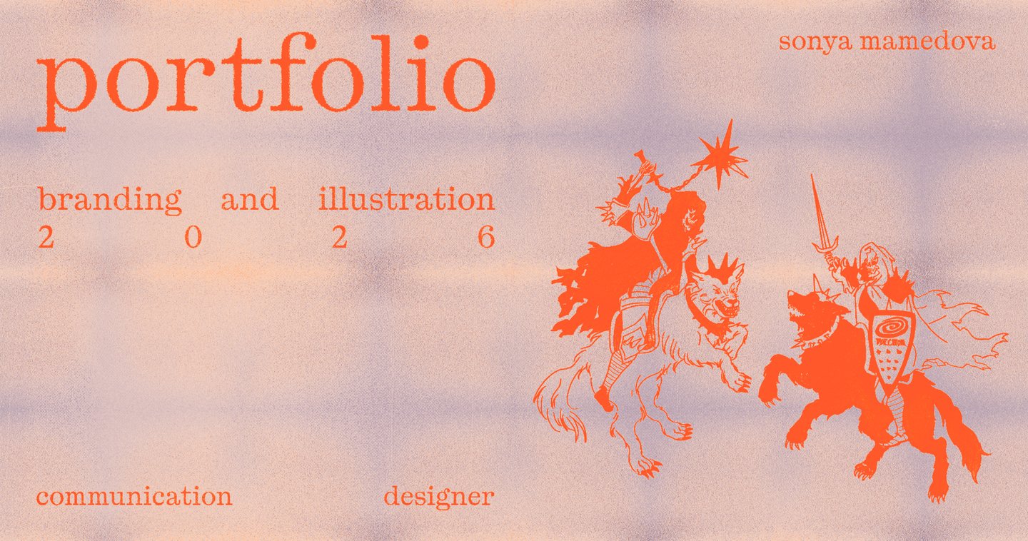
I’m Sonya and this is my portfolio
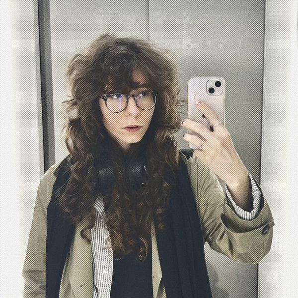
I’m a graphic designer and illustrator with a soft spot for bold ideas, unexpected visuals, and a little weirdness.I create expressive identities, prints, and illustrations for fashion, lifestyle, and cultural projects with personality — and something to say.
I like finding unexpected ways to express an idea. Through color, typography, illustration, and experimentation, I build visual languages that reflect the character of each project.
My approach combines a clear concept with room for play, creating work that feels distinctive without losing its purpose.
How do I work?
[01] — ExploreUnderstand the context, find references, and discover what makes the project different.[02] — ExperimentPlay with ideas, visual connections, and unexpected combinations.[03] — CreateTurn the concept into a distinctive visual language across different formats.
VOLCHOK
Print Design / Fashion / Illustration
Context & Challenge
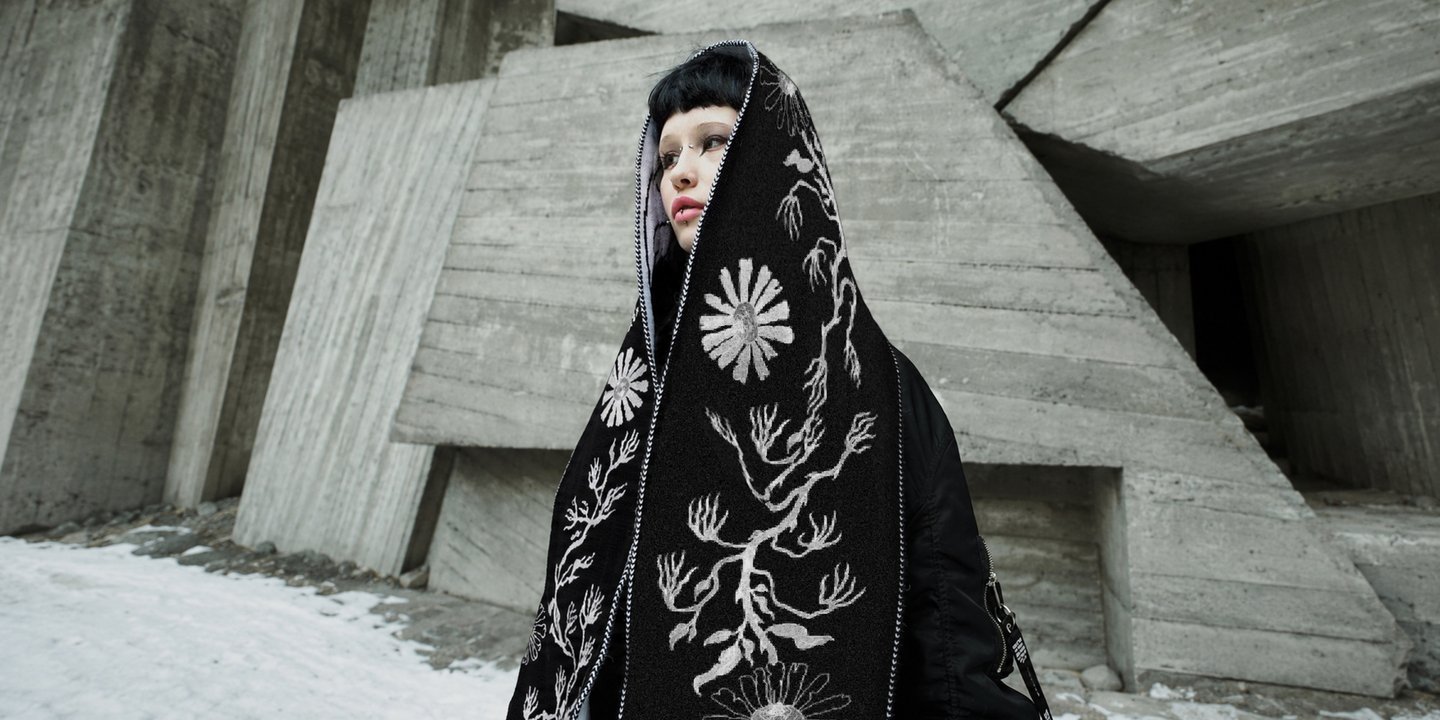
VOLCHOK is a Russian streetwear brand known for its dark aesthetics and references to post-Soviet culture. For its print competition, I developed a series of illustrations that would fit the brand’s visual identity while bringing a personal interpretation to it.
The idea
Medieval imagery meets modern anxiety.
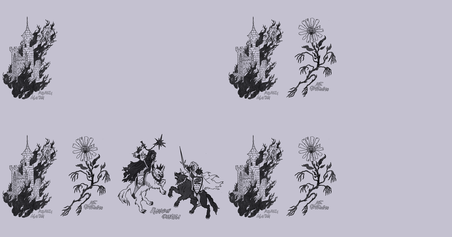
Inspired by the instability of the present, I turned to medieval symbolism, deconstructing familiar images through absurdity and dark humor. A burning castle, a monstrous flower, and skeletal knights challenge traditional ideas of safety, beauty, and heroism.
Visual Language
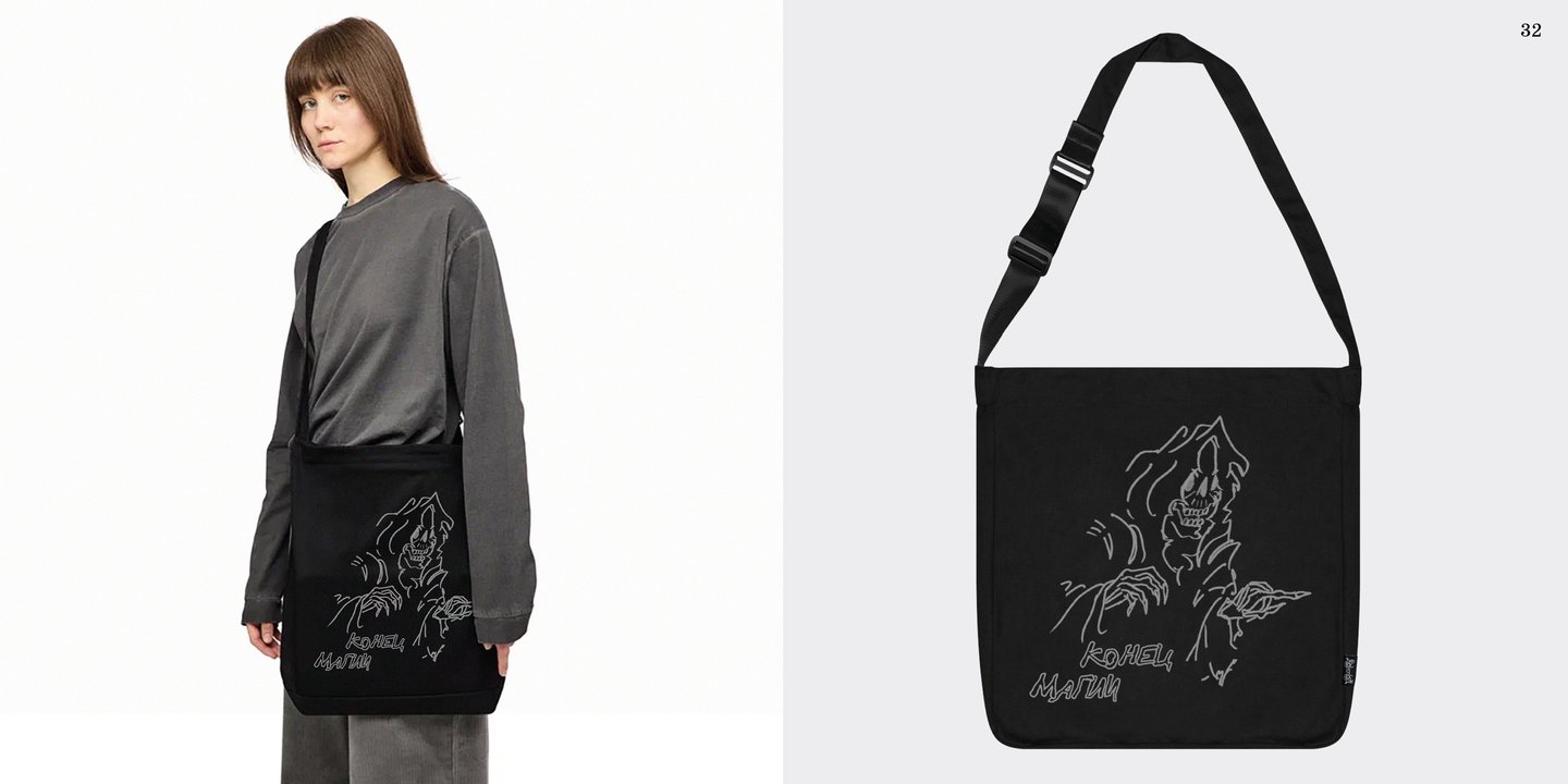
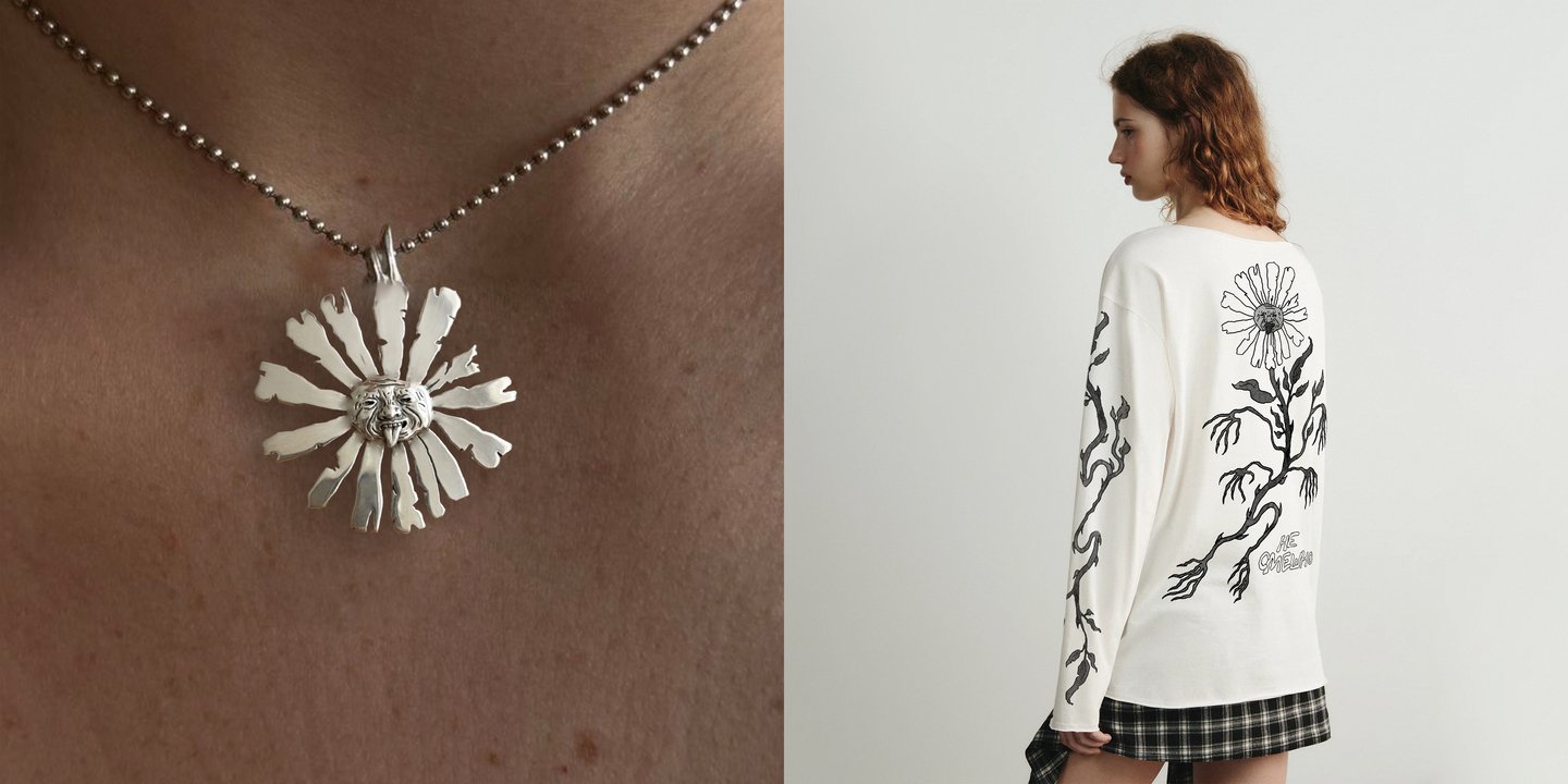
Three detailed black-and-white illustrations bring together gothic imagery, expressive linework, and surreal characters. The graphics were adapted for clothing, accessories, and other merchandise.

Outcome
Three original prints that bring medieval imagery, dark humor, and a contemporary attitude into VOLCHOK’s streetwear aesthetic.
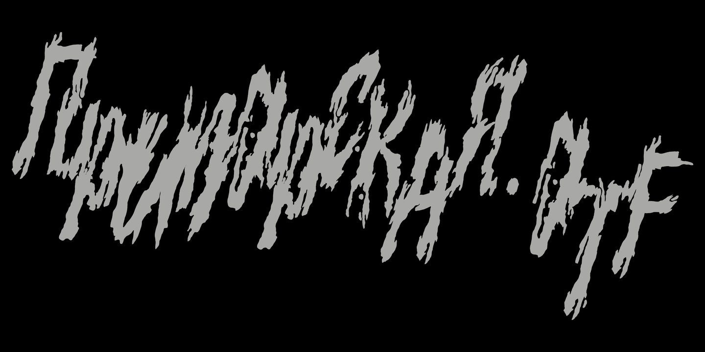
Primorskaya.otf
Experimental Typography / Type Design
Context
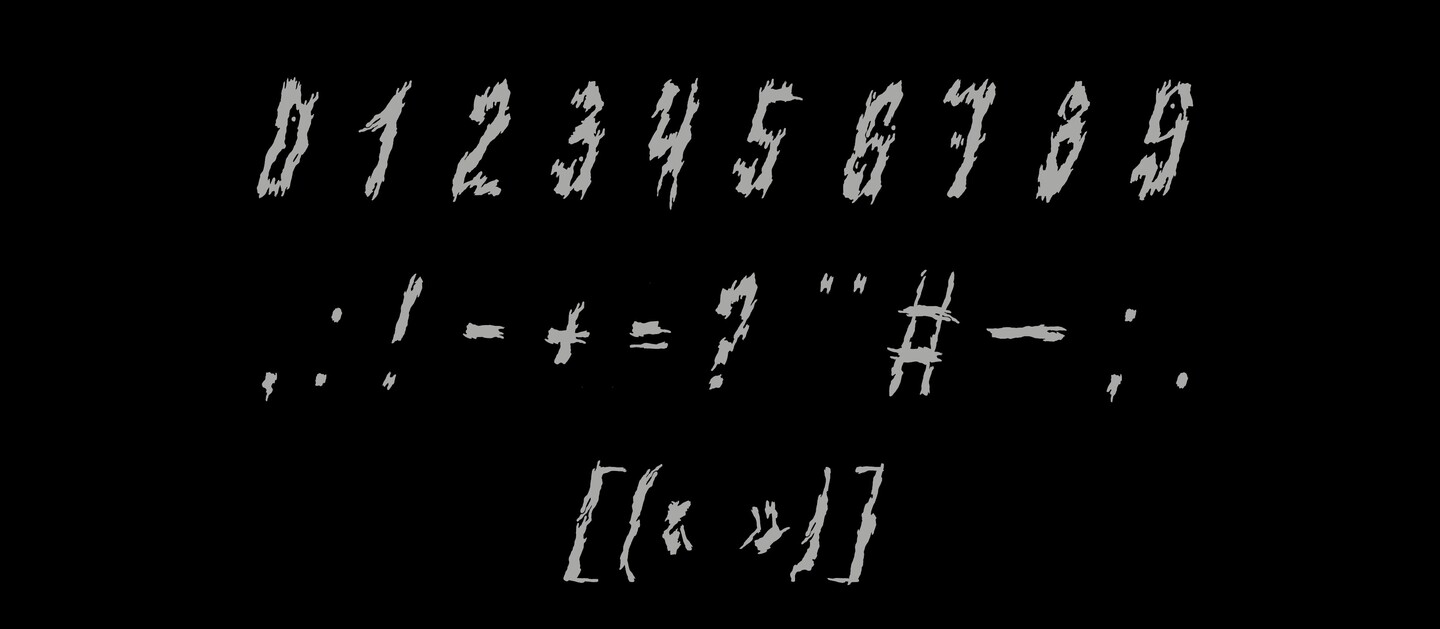
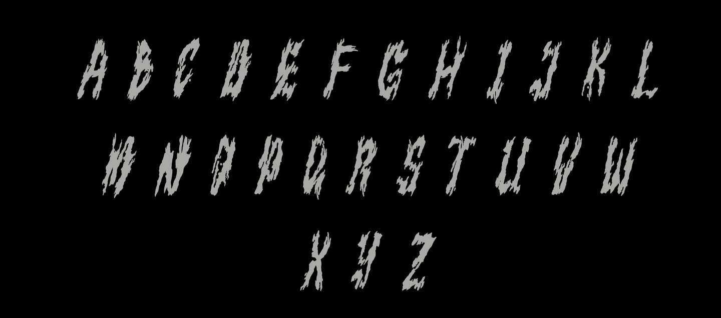
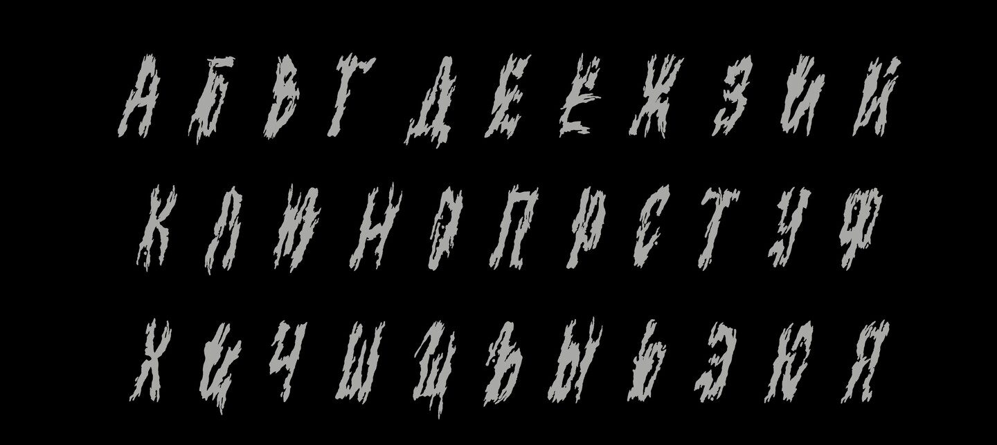
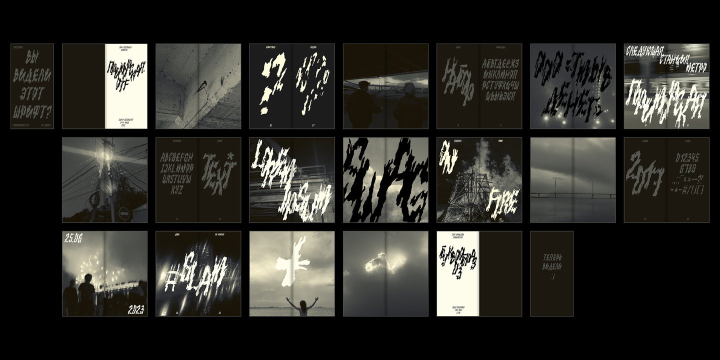
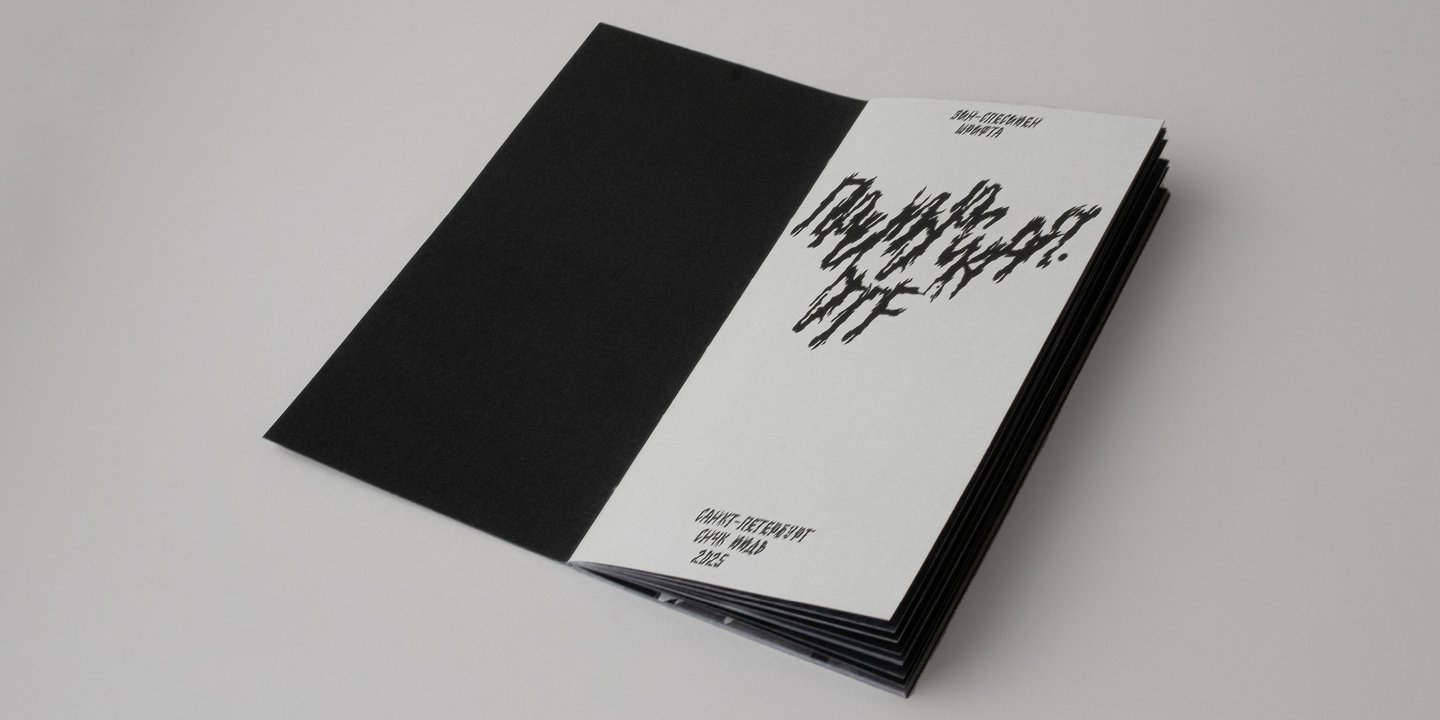
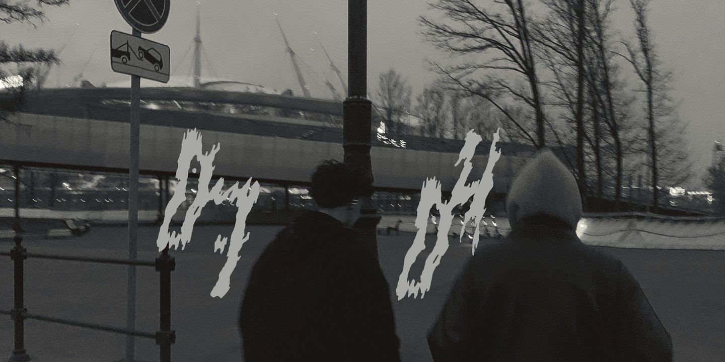
Primorskaya.otf is an experimental display typeface inspired by the veins of Karelian marble found on the walls of Primorskaya metro station in Saint Petersburg.
The Idea
From stone texture to letterforms.<
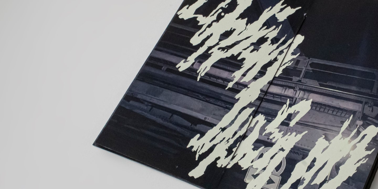
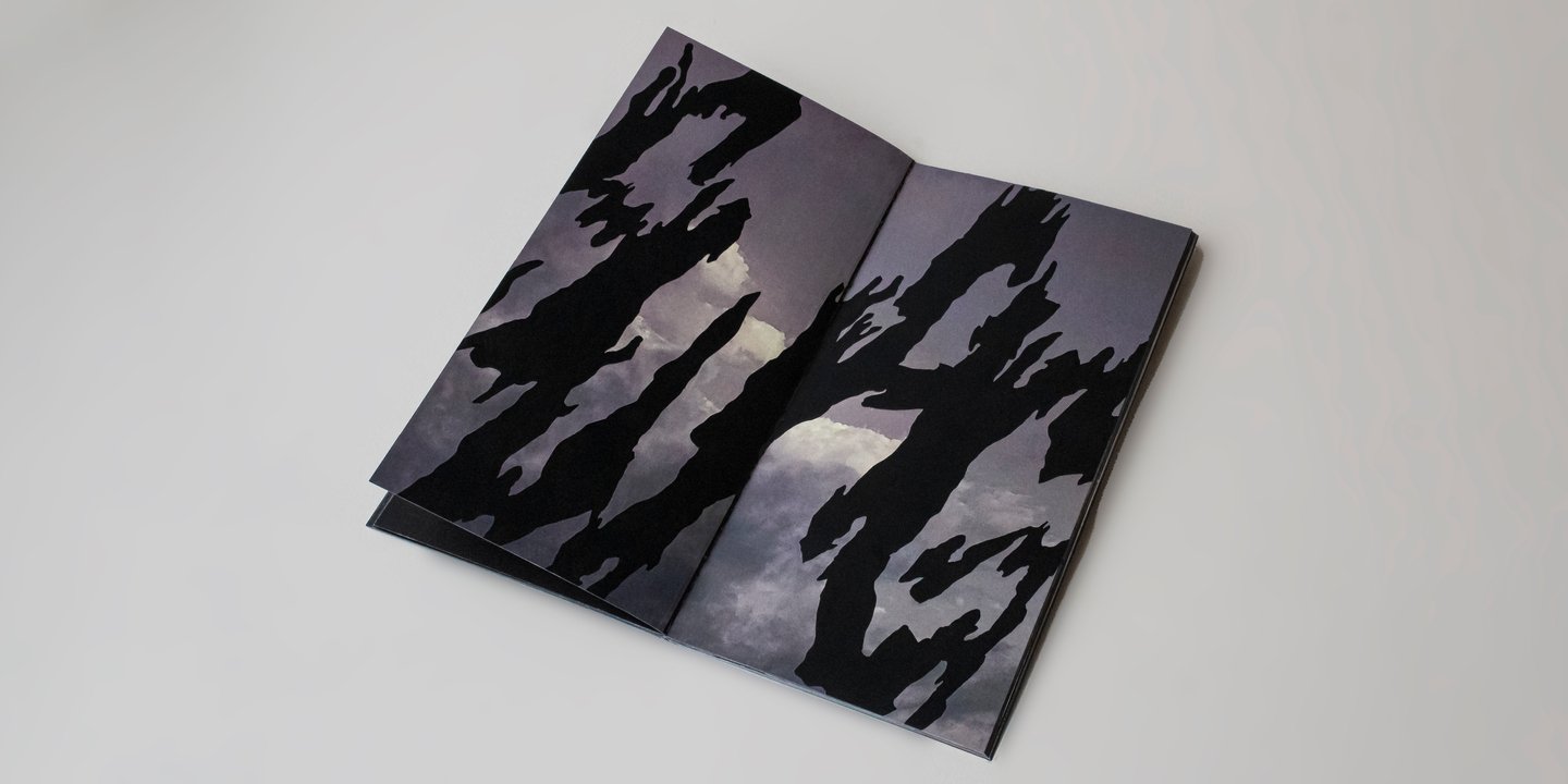
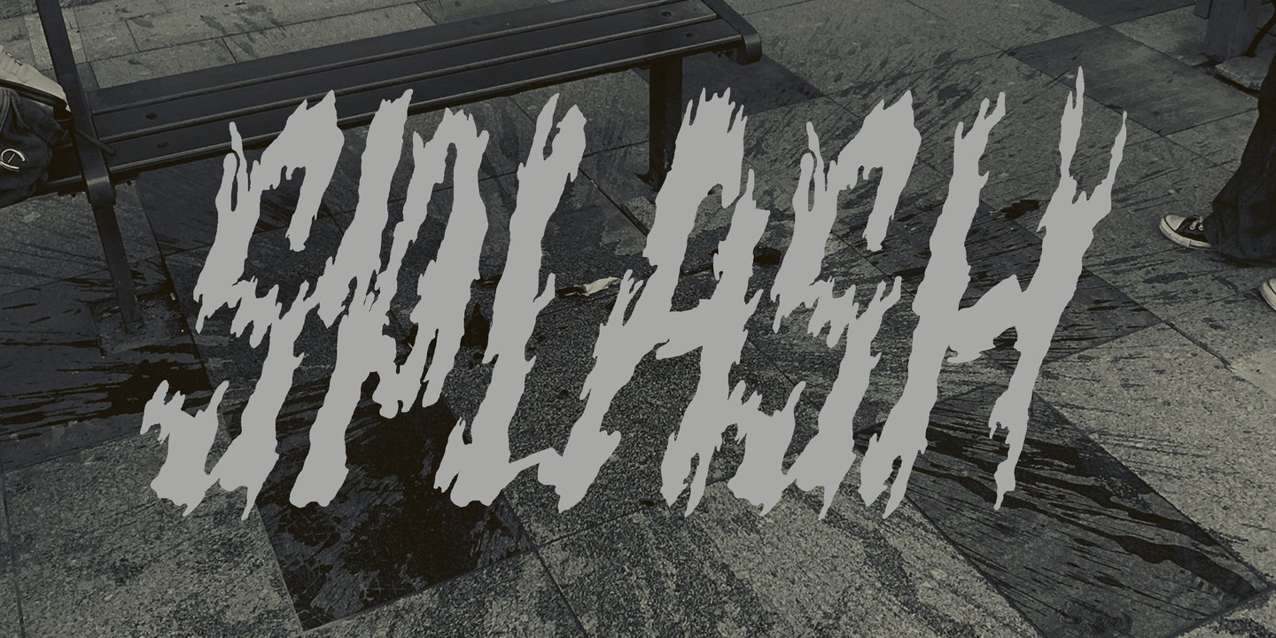
The irregular patterns of marble became the starting point for the typeface. I translated their sharp, fragmented shapes into expressive letterforms, preserving the unpredictable character of the original texture.
Visual Language
Sharp edges, fragmented strokes, and irregular silhouettes give the typeface its raw, expressive character.
Outcome
An experimental display typeface that transforms the textures of a familiar urban space into expressive letterforms.
SIGNAL
Visual Identity / Cultural Space
Context & Challenge
SIGNAL is a VHS club that brings together enthusiasts of analog media, from collecting videotapes and camcorders to watching films and making videos together.
The challenge was to develop a visual identity that would reflect both the culture of analog media and the club’s role as a meeting place.