DESIGN IS A WAY OF THINKING.
IDEAS INTO VISUAL EXPERIENCES.
graphic design · visual identity · editorial · typography
HELLO, I’M DARINA.
I am a graphic designer interested in visual storytelling, typography, and identity design. I enjoy exploring ideas, experimenting with visual language, and transforming concepts into clear and memorable experiences.
My work spans branding, editorial design, packaging, and visual experimentation. I believe that every project begins with a question—and that the right visual solution can make an idea meaningful.
SELECTED WORKS
01 Visual Research02 Festival Identity03 Typeface Design04 Packaging Design05 Brand Collaboration06 Calendar Design07 Experimental Typography08 3D / Spatial Design
01 ARCHIVE
THE EVOLUTION OF WOMEN’S COSMETIC ADVERTISING
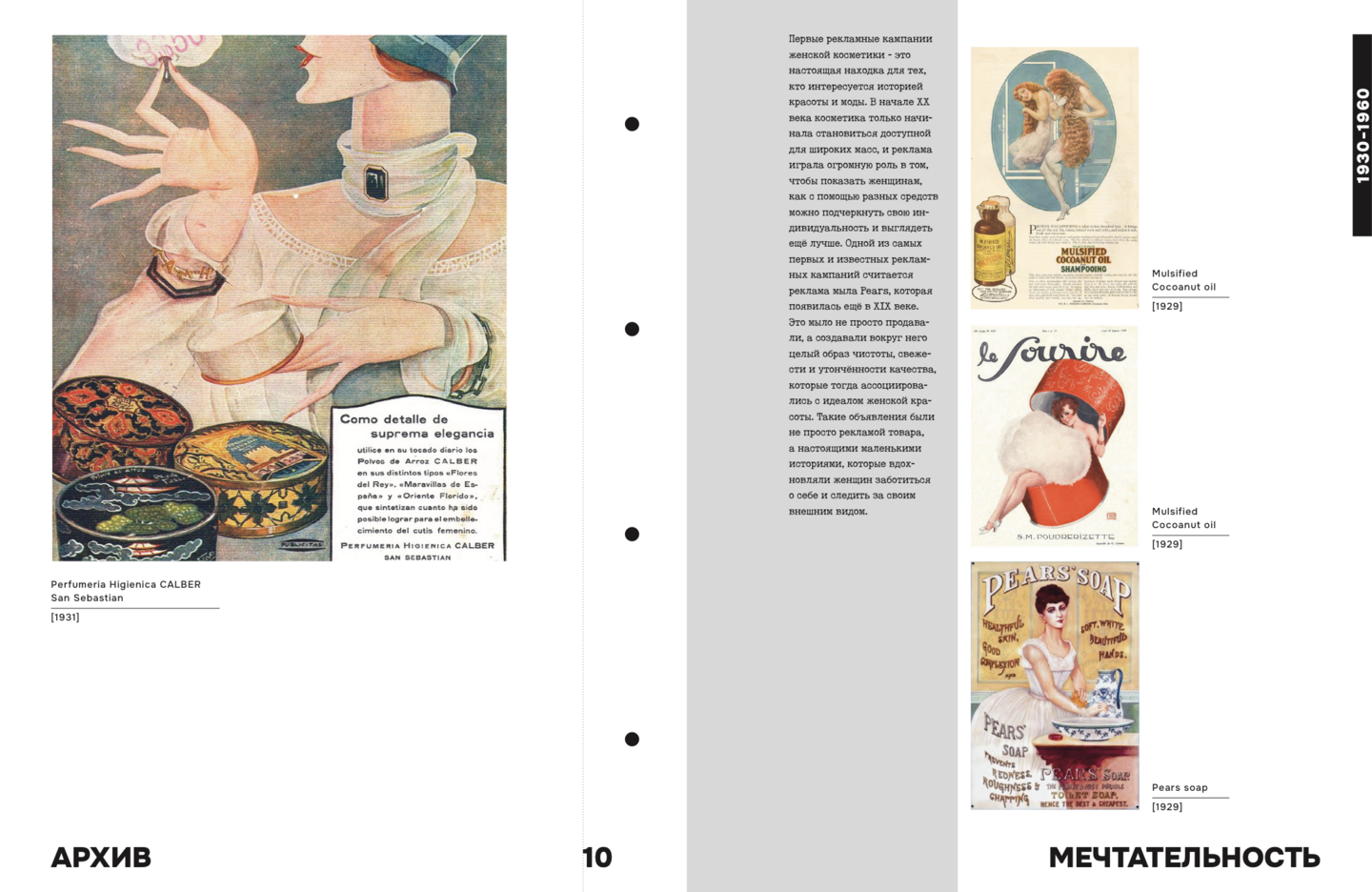
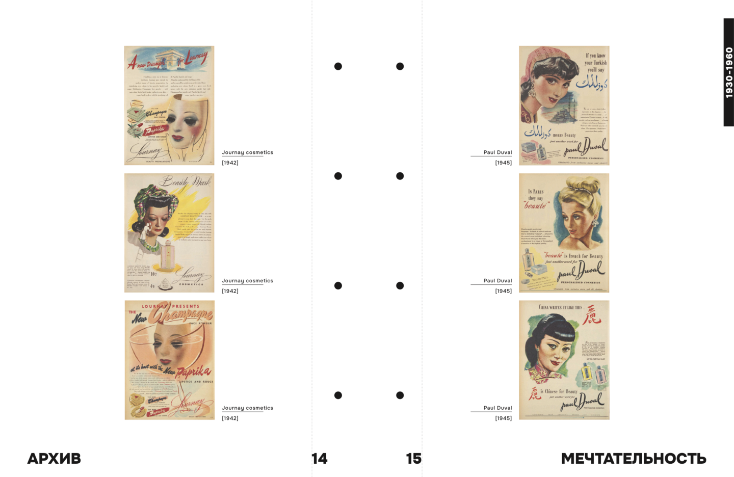
ARCHIVE is a visual research project exploring the evolution of women’s cosmetic advertising.
The project examines the shifting visual language of beauty—from advertising imagery and graphic styles to how ideals of femininity and beauty are communicated.
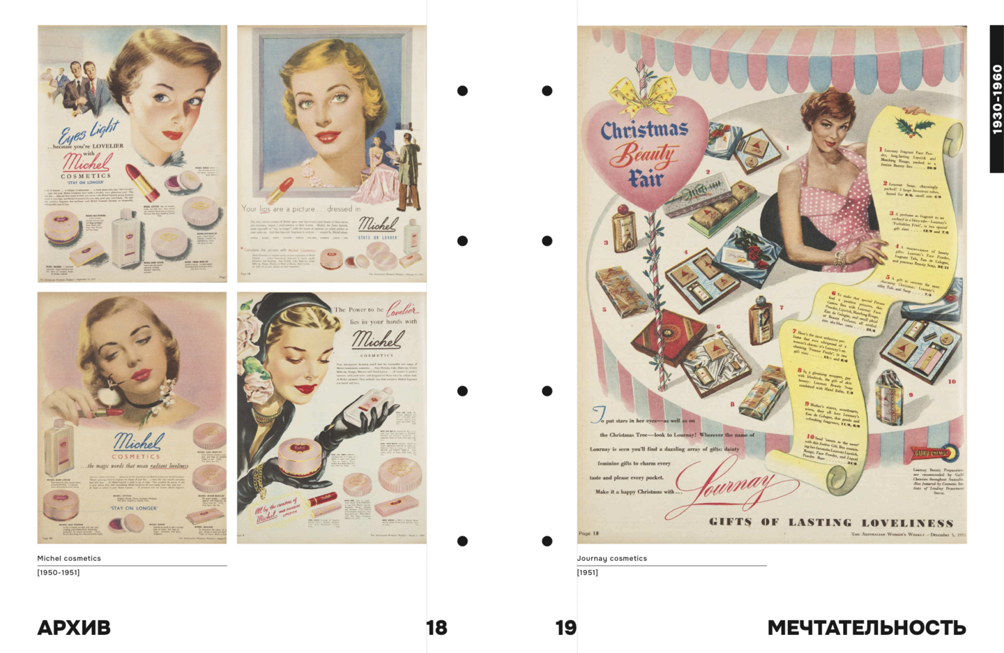
PROJECT TYPE VISUAL RESEARCH DISCIPLINE EDITORIAL DESIGN YEAR 2025
A VISUAL HISTORY OF BEAUTY
Advertising does more than present a product. It reflects the visual codes, cultural expectations, and ideals of its time.
By collecting and examining cosmetic advertisements, ARCHIVE brings together various approaches to beauty communication and reveals how their visual language evolves across generations.
02 MUA FEST
MAKEUP ARTIST FESTIVAL
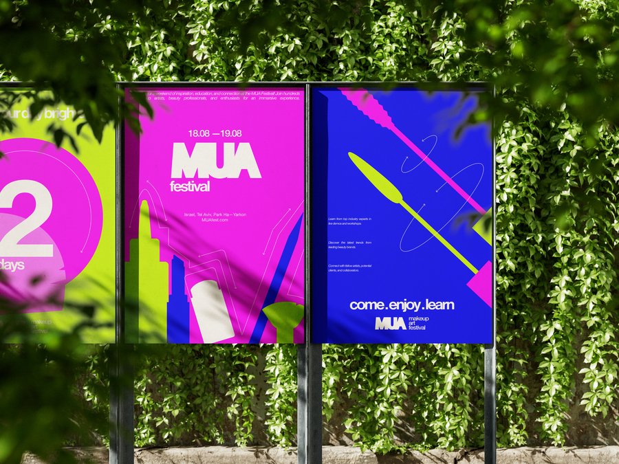
MUA is a festival concept created for make-up artists and creative individuals who want to connect, exchange ideas, and find inspiration.
Rather than a traditional series of lectures or masterclasses, the festival is designed as an energetic community event—a space for communication, experimentation, and shared experiences.
PROJECT TYPE VISUAL IDENTITY LOCATION HA-YARKON PARK AUDIENCE CREATIVE COMMUNITY
THE ENERGY OF MOVEMENT
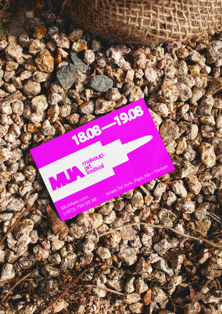
The visual concept centers on movement—a universal element that connects the act of applying makeup with the dynamic atmosphere of a creative community.
Scattered and overturned cosmetic objects become part of an expressive visual language. The result is a bold, chaotic, and abstract identity that reflects the festival’s free and experimental spirit.
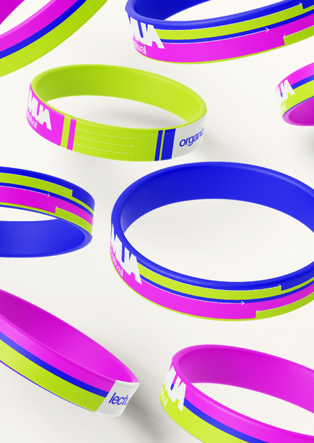
A COMMUNITY IN EVERY DETAIL
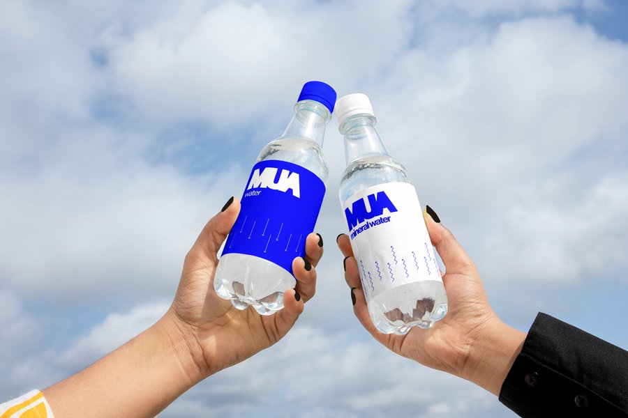
The identity is designed to work across different festival touchpoints, creating a recognizable visual experience and bringing the event’s atmosphere into every interaction.
03 SOFT MARK
AN EXPERIMENTAL DISPLAY TYPEFACE
SOFT MARK is a display typeface inspired by the visual language of the road environment.
Its design draws on the clear lines of road markings, recognizable road signs, pedestrian crossings, and tire patterns, translating familiar urban elements into a distinctive typographic system.
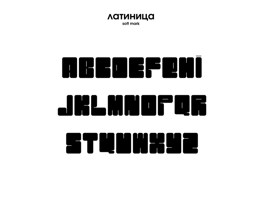
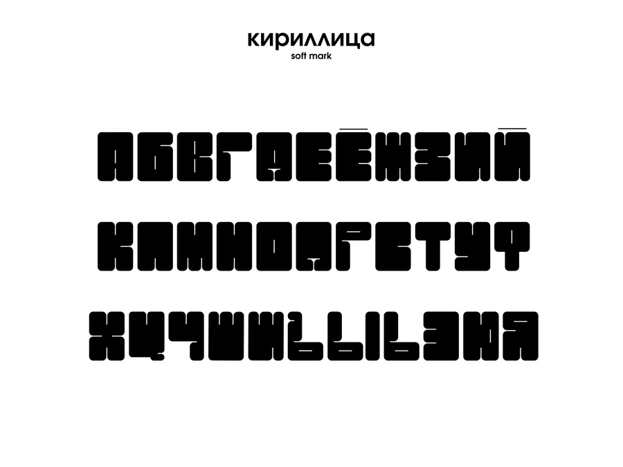
PROJECT TYPE TYPEFACE DESIGN FORMAT DISPLAY TYPEFACE SCRIPT CYRILLIC & LATIN
A SYSTEM OF CUTS
Each character is constructed using a systematic approach to cuts. Their size and placement remain consistent across the entire glyph set, achieving visual unity while maintaining high readability.
The typeface’s distinctive character is defined by its straight forms, rounded corners, and repetitive cut lines.