Portfolio of Elmira Aliibekova · Communication designer
Packaging · Branding
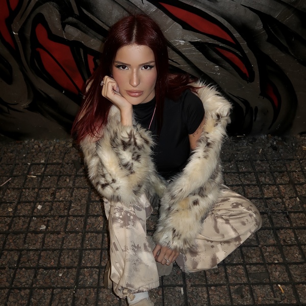
Hello, I’m Elmira! Communication designer I find one clear idea for a brand and grow it into a whole system: logo, packaging, print, space and digital. 4th-year design student at HSE, based in Saint Petersburg, looking for a full-time role in a branding team.
Hard skills — Branding and visual identity, packaging design, typography and layout, 3D packaging visualization in Blender, graphic design, presentation of visual concepts.
Soft skills — Developing cohesive visual concepts, translating ideas into clear visual solutions, combining creativity with strategic thinking, managing projects from concept to final presentation, attention to detail.
Education — HSE University, Art & Design School. Communication Design, 2023–2027.
Problems I solve for brands
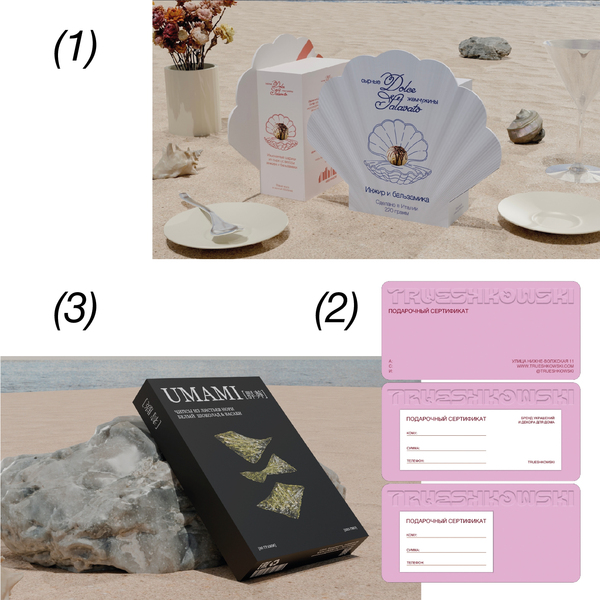
Problem 01. The product fails to stand out on the shelf. → Solution 01: Packaging that catches the eye and communicates the brand’s character. Case: DolceSalavato.Problem 02. The brand lacks a clear visual identity. → Solution 02: A cohesive visual system that makes the brand recognizable across touchpoints. Case: TRUESHKOWSKI.Problem 03. The design looks flat and fails to bring the idea to life. → Solution 03: 3D packaging visualization that makes the concept tangible and engaging. Case: Umami.
Who I work for
I work B2B: I turn ideas into visual identities people recognize and remember.
Branding studios need a designer who can take ownership of a project. I develop visual concepts and carry them through to the final design.Product brands need to stand out on the shelf. I create packaging and visual identities that capture attention and communicate what makes a product different.Ideas need to come to life. I use 3D visualization in Blender to present packaging concepts with depth, detail and impact.Not just how it looks. What it communicates.Insight — I explore the brand, its audience and its visual landscape.Concept — I develop a clear visual idea that captures the brand’s character.Identity — I turn that idea into a cohesive system across branding, packaging and visual communication.DolceSalavato
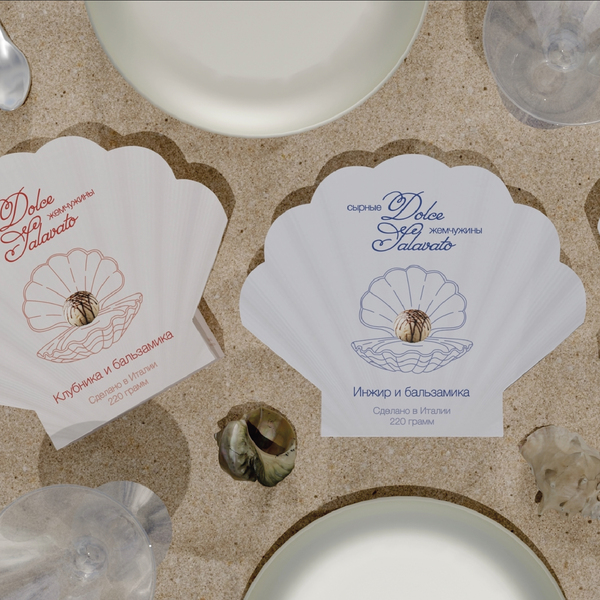
The Brief — Create a new food product and develop its packaging. DolceSalavato brings together Italian cheese pearls with three unexpected flavor combinations: fig and balsamic sauce, strawberry and balsamic sauce, and chocolate and balsamic sauce.The Idea — Turn an everyday bite into a small gastronomic ritual. Inspired by the elegance of Italian cuisine, I imagined the cheese pearls as precious jewels hidden inside a seashell.The Solution — A shell-shaped package that transforms the product into a refined culinary gift. Each flavor has its own color: red for strawberry, blue for fig, and brown for chocolate. The visual identity combines elegance, sensory appeal and the feeling of a little luxury.The Outcome — More than just packaging. A distinctive concept that turns an unusual food product into a memorable experience, making every bite feel like a small indulgence.
TRUESHKOWSKI
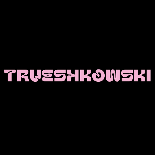
The Brief — TRUESHKOWSKI is an existing jewelry and home decor brand built around natural stones and the personality of its founder. The brand is bold, emotional and a little provocative, but stone jewelry is usually presented as calm and earthy, or as sweet and cute. Competitors already occupy these spaces: some rely on minimalism, others on a friendly, cozy tone. My task was to give TRUESHKOWSKI an identity that stands apart and feels as confident as the people who wear it.The Idea — Bold, not sweet. I defined the brand as a Lover with a touch of Rebel: warm and emotional, but never polite or official. This became the visual rule: soft, fluid letterforms that echo the rounded shapes of polished stones, and pink placed against black, turning a «gentle» colour into a loud and daring one. The brand speaks like a close friend who pushes you to be yourself.The Solution — I started with the strategy: mission, values, brand promise, tone of voice, taboos, target audience personas and competitor analysis. Then I translated it into a visual system: a custom wordmark, a pink-and-black palette and clean supporting typography. I applied the identity to brand touchpoints: embossed gift certificates where the logo becomes a tactile texture, and posters that carry the brand’s key messages, such as «Jewelry for the boldest» and «Gain confidence every day».The Outcome — A jewelry brand that talks like a bold friend, not a polite boutique. The strategy and the visuals tell the same story: courage, brightness and individuality. One confident pink voice runs from the logo to every printed piece, making the brand instantly recognisable among its competitors.
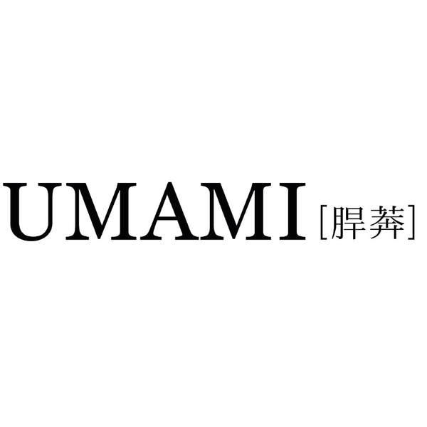
The Brief — Nori snacks usually fall into one of three types: a side for sushi, a health product, or a nameless store brand. None of them treat nori as a snack you eat simply for pleasure. I wanted to create a brand that does. The Idea — Umami is the unique taste, the one that’s hard to put into words. The brand behaves like a calm rebel. Nori with white chocolate and wasabi is surprising, but it’s served with quiet confidence rather than shock. The goal was modern Japanese taste without the clichés. The Solution — I built the brand from the strategy up: positioning, audience and tone of voice. Then I turned it into a visual system. It has a serif wordmark, a bracket motif that runs through every label, two colourways for two flavours, and floating nori chips as the key visual. I modelled and rendered the packaging in 3D in Blender, then extended the identity to a city poster and business cards. The Outcome — A snack that looks like a design object on the shelf. It’s bold in flavour and calm in form. One idea carries through from brand strategy to the box.
Typography
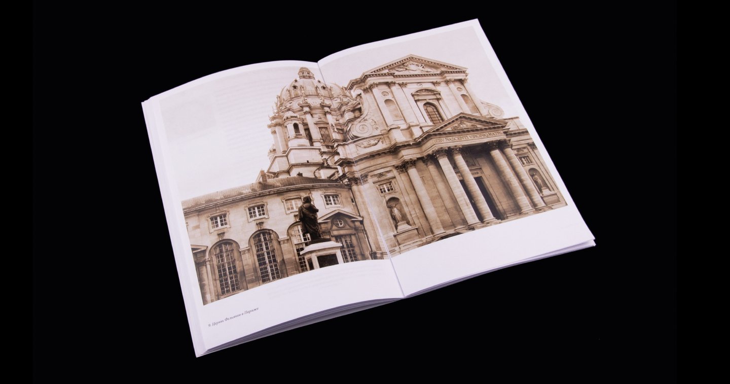
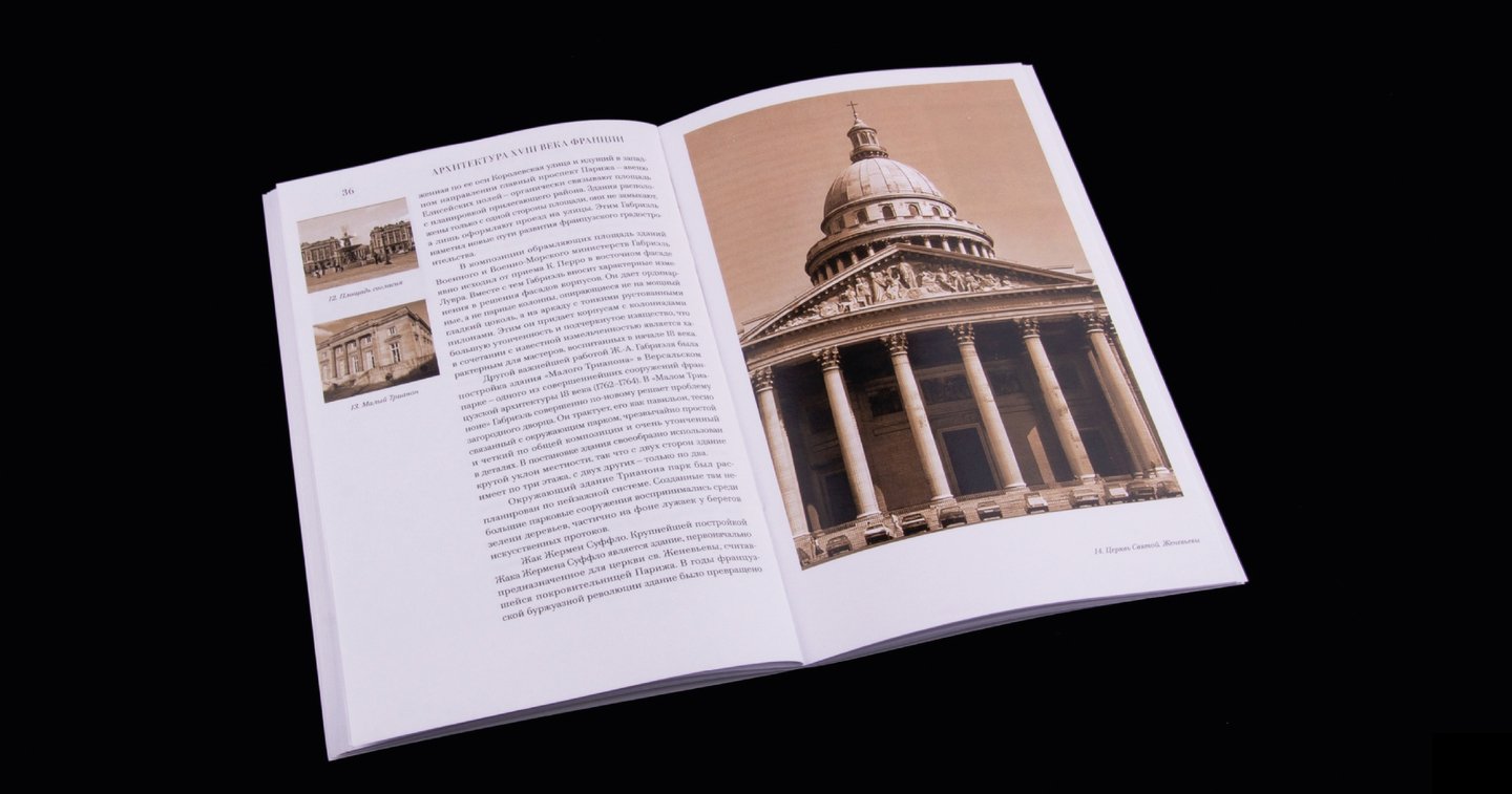
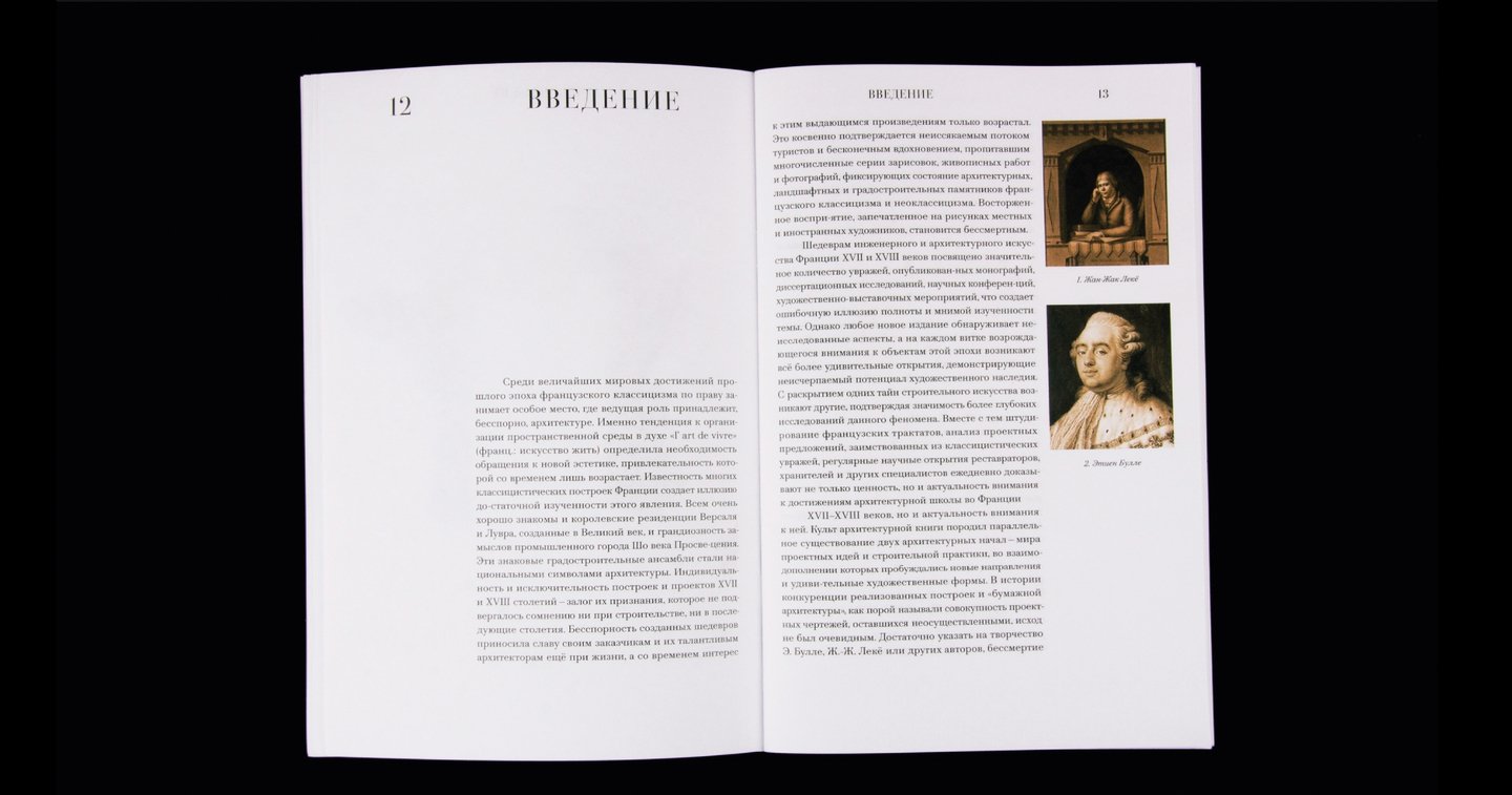
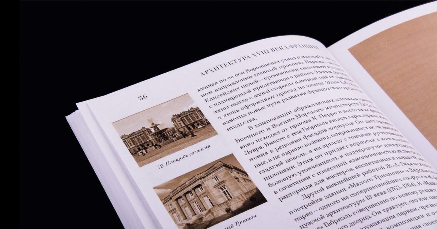
For me, typography is about creating a cohesive visual language through a clear system of grids, type hierarchy and rhythm that guides the reader smoothly from beginning to end.
Let’s work together!
One idea became a visual identity. One concept took shape through design. One brand found its own visual language. One product became something to remember.
Let’s create something meaningful together!