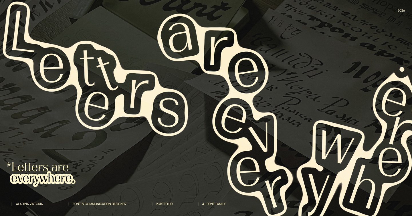

Hi, i’m Vika!Аs you can probably tell, I really love letters in all their forms and manifestations. That’s why, for the most part, my work is related to font design, primarily the development of font systems.For me, it’s important not only to develop expressive letterforms but also to ensure their consistency. That’s why I enjoy working on large‑scale expansions of font families, exploring variations, additional stylistic sets, ligatures, and alternatives, and tying all of this together with meanings and concepts.Besides type design, I also work on book layouts, visual identities, and packaging, with typography at the core of my approach.
MY APPROACH
From an idea to a cohesive type system
01 / EXPLOREI explore the context, purpose, and visual references to understand what the typeface needs to communicate.02 / DISCOVERI find the core idea and translate it into distinctive letterforms, defining the character and visual principles of the typeface.03 / DEVELOPI bring individual letterforms together into a cohesive and flexible type system, where every element works in harmony.
But sometimes different typeface tasks require different design approaches. Therefore, in my projects, I have worked both on flexible
and cohesive typeface systems and on individual display fonts, where the main focus is on the expressiveness and character of the letter forms.
Case № 1: Typeface as a system
DAPPIER NEUE
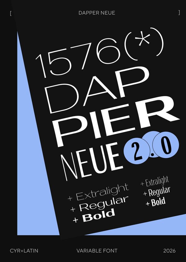
Dappier Neue is an expanded version of Dappier, a Linear-Antiqua typeface with moderate stroke contrast and an existing weight axis ranging from ExtraLight to Bold.Challenge: To expand the type family by introducing a second variable axis for width, ranging from Condensed to Extended, while preserving the distinctive characteristics of the letterforms.Solution: Four master styles were developed, two of which were specifically designed to ensure smooth interpolation. This resulted in a cohesive and flexible type system that retains its distinctive visual features.
To improve interpolation between the ExtraLight and Bold styles, a Regular master was developed as a versatile intermediate design, ensuring smooth and consistent interpolation across the entire type family.
Case № 2: Alternatives and ligatures
QUEEN OF SPORTS
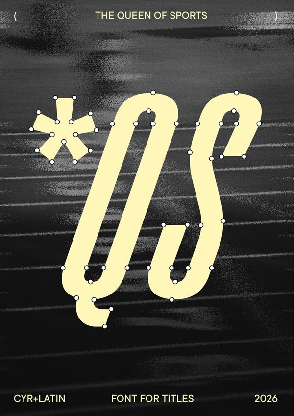
Queen of Sports is a typeface developed for Queen of Sports, a documentary series about track and field athletics.Challenge: To convey the sporting character and dynamic nature of the documentary through the design of its letterforms.Solution: The letterforms feature offset oval and semi-oval shapes inspired by running track lane markings, along with a slant that creates a sense of movement. Distinctive ligatures and alternate numeral glyphs were also developed to emphasize the sporting theme. The ligatures also allow the typeface to adapt to both large headlines and smaller sizes.
Alongside alternate numeral glyphs, commonly used in sports-related graphics, the typeface’s visual character is complemented by alternate arrow glyphs that work well in combination with the additional numeral forms.
Case № 3: Character of the form
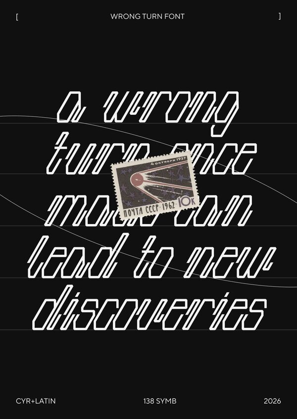
WRONG TURN
Wrong Turn is an experimental display typeface with monolinear strokes and a distinctive visual character.Challenge: To create an expressive monolinear display typeface while maintaining legibility and structural consistency across all glyphs.Solution: A unified construction grid was developed for all glyphs. Its defining feature is the open stroke terminals, which reinforce the rhythm of negative space between the stems, creating distinctive and expressive letterforms.